 |
| Register | Login | |||||
|
Main
| Memberlist
| Active users
| ACS
| Commons
| Calendar
| Online users Ranks | FAQ | Color Chart | Photo album | IRC Chat |
|
| | |||
|
| Register | Login | |||||
|
Main
| Memberlist
| Active users
| ACS
| Commons
| Calendar
| Online users Ranks | FAQ | Color Chart | Photo album | IRC Chat |
|
| | |||
| 0 user currently in Modern Art. | 1 guest |
| Acmlm's Board - I2 Archive - Modern Art - New sig. |
 | |  | |  |
| Add to favorites | "RSS" Feed | Next newer thread | Next older thread |
| User | Post | ||
windwaker Ball and Chain Trooper WHY ALL THE MAYONNAISE HATE Level: 61  Posts: 541/1797 EXP: 1860597 For next: 15999 Since: 03-15-04 Since last post: 4 days Last activity: 6 days |
| ||
It sucks, but yeah.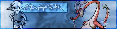 I need serious direction on my PS skills. Plz critique  . . |
|||
|
Tarale I'm not under the alfluence of incohol like some thinkle peop I am. It's just the drunker I sit here the longer I get.  Level: 73  Posts: 864/2720 EXP: 3458036 For next: 27832 Since: 03-18-04 From: Adelaide, Australia Since last post: 4 hours Last activity: 2 hours |
| ||
| I like your border, and I like the bluey-grey you've used. However, it's a little hard to read your name on that.... |
|||
|
windwaker Ball and Chain Trooper WHY ALL THE MAYONNAISE HATE Level: 61 Posts: 544/1797 EXP: 1860597 For next: 15999 Since: 03-15-04 Since last post: 4 days Last activity: 6 days |
| ||
| Thanks, yeah, that was a bit hard to read. I made the stroke color darker and the Overlay darker. | |||
SyntaxLegend Double metal axe Level: 25  Posts: 116/222 EXP: 78264 For next: 11356 Since: 04-21-04 From: Australia Since last post: 20 days Last activity: 10 hours |
| ||
| it looks good, if i remember correctly, the font is Angryblue, the style is crystal. I used that a lof for my designs. 1 thing i didnt get is why everything was a bluey color except for the dragon thing. | |||
|
Keikonium Banned Level: NAN Posts: 866/-2459 EXP: NAN For next: 0 Since: 04-02-04 Since last post: 63 days Last activity: 9 hours |
| ||
| That looks pretty good except for your name being partly over Links face. You shouldn't have the light blue box behind your name, and link should be in colour to match with the dragon. Then center your name between link and the dragon and it will look awesome! | |||
|
windwaker Ball and Chain Trooper WHY ALL THE MAYONNAISE HATE Level: 61 Posts: 546/1797 EXP: 1860597 For next: 15999 Since: 03-15-04 Since last post: 4 days Last activity: 6 days |
| ||
| That box is actually over my name and set to Overlay. Wow SL, you're right, that is Angryblue. I thought that if I used the bluey stuff for everything, it'd be too bland, so I put the dragon in as a bit transparent. Edit: eck, I forgot to save it as a PSD  , so I made a new one, which I like a lot more. , so I made a new one, which I like a lot more.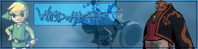 |
|||
|
Xkeeper The required libraries have not been defined. Level: NAN  Posts: -3015/-863 EXP: NAN For next: 0 Since: 03-15-04 Since last post: 2 hours Last activity: -753366 sec. |
| ||
| ...except that now the "R" is almost completely unreadable. Very nice though  |
| Add to favorites | "RSS" Feed | Next newer thread | Next older thread |
| Acmlm's Board - I2 Archive - Modern Art - New sig. |
| | |

