 |
| Register | Login | |||||
|
Main
| Memberlist
| Active users
| ACS
| Commons
| Calendar
| Online users Ranks | FAQ | Color Chart | Photo album | IRC Chat |
|
| | |||
|
| Register | Login | |||||
|
Main
| Memberlist
| Active users
| ACS
| Commons
| Calendar
| Online users Ranks | FAQ | Color Chart | Photo album | IRC Chat |
|
| | |||
| 1 user currently in Super Mario World hacking: |
| Acmlm's Board - I2 Archive - Super Mario World hacking - New title screen, looking for comments |
 | |  | |  |
| Add to favorites | "RSS" Feed | Next newer thread | Next older thread |
| User | Post | ||
|
Sukasa Boomboom Error 349857348734534: The system experienced an error. Level: 57 Posts: 1623/1981 EXP: 1446921 For next: 39007 Since: 02-06-05 From: *Shrug* Since last post: 6 days Last activity: 1 day |
| ||
| Um, yeah. the title says it all. I redid my intro screen for COTMK 2, and was wondering what you guys thought/ how I could improve it. It's too similar to BMF's, and I'd like ideas for how to change it while still keeping the overall "feel" to it. The picture: 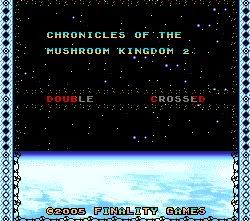 |
|||
|
Smallhacker Green Birdo SMW Hacking Moderator Level: 68 Posts: 1985/2273 EXP: 2647223 For next: 81577 Since: 03-15-04 From: Söderhamn, Sweden Since last post: 10 hours Last activity: 9 hours |
| ||
| Not bad. I suggest using another font for the title, though, since the regular one looks... well... too regular... (edited by Smallhacker on 08-12-05 08:35 PM) |
|||
|
SoNotNormal Fuzzy Level: 34 Posts: 166/793 EXP: 248340 For next: 5311 Since: 07-01-05 From: Canada, eh? Since last post: 6 hours Last activity: 6 hours |
| ||
| Nice, but it's just a teensy bit hard to read - is that BG Death Egg Zone from sonic? It looks pretty sweet. | |||
|
Sukasa Boomboom Error 349857348734534: The system experienced an error. Level: 57 Posts: 1624/1981 EXP: 1446921 For next: 39007 Since: 02-06-05 From: *Shrug* Since last post: 6 days Last activity: 1 day |
| ||
| I'll keep the font in mind, the nice thing is that the game's font is still a WIP, so by the time the next dem ocomes out, it will be better. That is the death egg BG, but I had to change it's palette to accommodate the Layer 3 colours, which for the title screen are pasted over the other palette entries. | |||
|
Golden Yoshi Pokey Level: 41  Posts: 512/693 EXP: 445575 For next: 34570 Since: 03-15-04 From: Edison, NJ Since last post: 17 hours Last activity: 8 hours |
| ||
| Looking quite good, I'd also recommend a new, bigger, more decorative font, since the top half of the screen looks a bit unexciting except for the BG. The border is looking nice too. The only thing that needs work is the top half and it will look really good. | |||
|
Sukasa Boomboom Error 349857348734534: The system experienced an error. Level: 57 Posts: 1625/1981 EXP: 1446921 For next: 39007 Since: 02-06-05 From: *Shrug* Since last post: 6 days Last activity: 1 day |
| ||
| Thanks. The red and green dots on layer 3 are also animated, they flash in a 16-frame animation. A bigger font...? I've got just the idea! | |||
|
ExKeeper Bullet Bill Level: 31  Posts: 447/512 EXP: 180084 For next: 5279 Since: 03-05-05 From: Riiight ^ Since last post: 1 day Last activity: 6 hours |
| ||
| try to make it scroll vertically instead of horizontally to make it look like you are taking off/landing, and maybe put a rocket ship on layer 3 | |||
|
Super_Mario_world_Freak Paragoomba Banned until 10/3 Registering duplicate accounts, spamming, repeat offender. Level: 11  Posts: 8/66 EXP: 4851 For next: 1134 Since: 08-12-05 Since last post: 69 days Last activity: 55 days |
| ||
| Dude, that will make it, good job you made! | |||
Link2004 Bit Level: 25  Posts: 140/254 EXP: 85703 For next: 3917 Since: 08-11-04 From: Lost Woods Since last post: 7 hours Last activity: 4 hours |
| ||
This looks very nice, Sukasa. If you add bigger text, it will look even better. Great job!  |
|||
|
Chaos Force Panser Level: 29 Posts: 321/332 EXP: 147860 For next: 25 Since: 03-15-04 Since last post: 21 days Last activity: 4 hours |
| ||
| Nice, the the text for the title is way too small... | |||
|
fabio Chuck Level: 45  Posts: 688/1479 EXP: 629903 For next: 30261 Since: 07-02-05 From: Somewhere in Texas Since last post: 7 hours Last activity: 7 hours |
| ||
| On the Double Crossed word in the title screen, while is the words in two different colors? I think it would look better if it was one color. Just a suggestion. (edited by fabio on 08-13-05 05:28 PM) |
|||
|
ExKay Somebody set up us the bomb! Level: 50 Posts: 895/1114 EXP: 908268 For next: 39049 Since: 03-15-04 From: Hannover, Germany Since last post: 14 hours Last activity: 1 hour |
| ||
Now I have to make another intro BG.  I used the same like you. Anyway, fix up the font and it will look great. I used the same like you. Anyway, fix up the font and it will look great.  |
| Add to favorites | "RSS" Feed | Next newer thread | Next older thread |
| Acmlm's Board - I2 Archive - Super Mario World hacking - New title screen, looking for comments |
| | |

