 |
| Register | Login | |||||
|
Main
| Memberlist
| Active users
| ACS
| Commons
| Calendar
| Online users Ranks | FAQ | Color Chart | Photo album | IRC Chat |
|
| | |||
|
| Register | Login | |||||
|
Main
| Memberlist
| Active users
| ACS
| Commons
| Calendar
| Online users Ranks | FAQ | Color Chart | Photo album | IRC Chat |
|
| | |||
| 1 user currently in Super Mario World hacking: |
| Acmlm's Board - I2 Archive - Super Mario World hacking - Upcoming hack. |
 | |  | |  |
| Pages: 1 2 | Add to favorites | "RSS" Feed | Next newer thread | Next older thread |
| User | Post | ||
|
ExKay Somebody set up us the bomb! Level: 50 Posts: 754/1114 EXP: 908268 For next: 39049 Since: 03-15-04 From: Hannover, Germany Since last post: 14 hours Last activity: 1 hour |
| ||
| Me and Ghettoyouth are working on a hack called "Mario in Goomba's World". The story line is simple, Peach got kidnapped by a mutated Goomba, which will kill her if Mario doesn't hurry. Bowser will also be replaced by this Goomba.  Here are some screen: 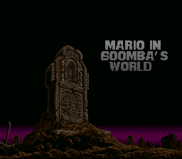 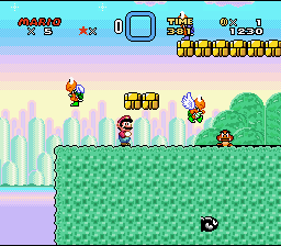  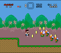 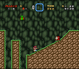 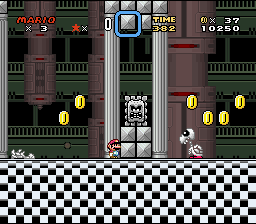 Comments? (edited by Ice Man on 06-13-05 04:30 AM) |
|||
|
Shadow Red Koopa Level: 17  Posts: 73/125 EXP: 22852 For next: 1891 Since: 02-08-05 From: Puerto Rico Since last post: 31 days Last activity: 1 day |
| ||
| It's lookin good! I think you should change Mario's Gfx and use the SMB2 one.I think the game's gfx style will look better with it.Great title! I love the trees and water bg and the cave one! Would be interesting if you make giant goombas.You can make them replacing Mecha Koopas,I did it in my Giant land 2.Keep it up! (edited by Shadow on 06-13-05 05:26 AM) |
|||
|
mikepjr Ninji Level: 26  Posts: 127/242 EXP: 92006 For next: 10269 Since: 03-15-04 From: houston texas Since last post: 4 days Last activity: 1 hour |
| ||
| Let's see, i see some super adventure island graphics, i see some castlevania graphics, and i think i even see some kerby's dreamland 3 graphics in there,and i see some mega man x graphics it looks like, and i do not know where those trees came from, but they do look awsome. Keep up the awsome work man! It all looks very colorfull. |
|||
|
XPeter Fuzz Ball Level: 42  Posts: 511/963 EXP: 501695 For next: 19667 Since: 01-24-05 From: South Ireland Since last post: 1 hour Last activity: 26 min. |
| ||
1st screen: doesn't load for some reason  2nd screen: beautiful! i love the BG palette! all the bad guys fit in well, and those bricks look kinda cool!
3rd screen: looks very nice too. interesting BG and a suitable palette. it's great what you've done with the ground, a nice alternation of the green one.
4th screen: the BG looks cool.
5th screen: i can't really say i like anything here.
6th screen: looks great, cool floor, and i think the BG fits in well.
Overall it looks fantastic! i can't wait to see more of this.
2nd screen: beautiful! i love the BG palette! all the bad guys fit in well, and those bricks look kinda cool!
3rd screen: looks very nice too. interesting BG and a suitable palette. it's great what you've done with the ground, a nice alternation of the green one.
4th screen: the BG looks cool.
5th screen: i can't really say i like anything here.
6th screen: looks great, cool floor, and i think the BG fits in well.
Overall it looks fantastic! i can't wait to see more of this.  PS i agree with Shadow about the SMB2 Mario.
 |
|||
|
ExKay Somebody set up us the bomb! Level: 50 Posts: 755/1114 EXP: 908268 For next: 39049 Since: 03-15-04 From: Hannover, Germany Since last post: 14 hours Last activity: 1 hour |
| ||
@peter: You can't see the best screenshot from there, which is pic no.1  Anyway, can you give me the SMB2 Mario? |
|||
|
Rainbow Yoshi Level: 30  Posts: 271/496 EXP: 159486 For next: 6383 Since: 04-08-05 Since last post: 14 hours Last activity: 4 hours |
| ||
| Looks cool Ice Man and Ghettoyouth. (no pun intended) Looks very nice but for some reason the title screen seems out of place there. It looks like such a happy hack but the title screen is all dark and gloomy. (edited by RR on 06-13-05 07:11 AM) (edited by RR on 06-13-05 07:12 AM) |
|||
|
Keikonium Banned Level: NAN Posts: 1338/-2459 EXP: NAN For next: 0 Since: 04-02-04 Since last post: 63 days Last activity: 9 hours |
| ||
| This looks awesome, I need to comment on this! 1. Title screen looks amazing! Only 2 things I see that need some work. First change that title. Not the words, just the way it looks. It doesn't look very good at all. The "A", "W", "M", and "G" look really badly drawn, and the word "IN" looks bad also. The "I" is way to small and thin compared to the "N". Just fix up the way the letters look, and that will be awesome! Another thing you may want to try, is experimenting with the sky. Maby making it red, or a dark blue or something. It looks good how it is, but maby making it something different may look better? 2. Hey is that BG from a japanese game full of "loveing" type stuff? I can't think of the name, but its got really big ground tiles, and its got 3 main characters. Either way it looks good! The blocks look really neat also. Good job! 3. I want that background!!! That looks amazing man. The ground is really well done, and fits the marioish style very well (probably cause its mostly taken from SMB3?). Does that "Eat Us" bubble flash? The pipe looks a bit to bright for the level tho...darkening the palette maby? This level looks nice. 4. Hate the BG, palette problems in it, and the staus bar. And the ground looks like something from SSW. I really dont like this at all. It looks like something from a completly different hack  . .5. I have a BG that looks almost the exact same in my hack. That ground is even used in the level  . This screen looks really nice none the less. . This screen looks really nice none the less.6. I'm not much for mechanical metal like backgrounds, but this looks good. Your hack looks awesome!! I really want a demo of this. It looks awesome, can't wait to play it! Keep up the good work! |
|||
|
ExKeeper Bullet Bill Level: 31  Posts: 323/512 EXP: 180084 For next: 5279 Since: 03-05-05 From: Riiight ^ Since last post: 1 day Last activity: 6 hours |
| ||
| Nice GFX, where did you get it? edit: I know the one in the last screen came from one of the MMX games, it just has a different palette (edited by smwedit on 06-13-05 07:47 AM) (edited by smwedit on 06-13-05 07:51 AM) |
|||
|
XPeter Fuzz Ball Level: 42 Posts: 512/963 EXP: 501695 For next: 19667 Since: 01-24-05 From: South Ireland Since last post: 1 hour Last activity: 26 min. |
| ||
| Ice Man, i'll look into loading the first screen, i'm not really sure why it doesn't load. okay sure i'll give you the SMB2 Mario (you could just rip it from the demo i released on the Ice Board) but i should remind you of something: in SMB2, Mario can't swim or fly or do anything special, so you'll need to hand draw seperate GFX to accommodate situations like that. i'll get back to you on which ones exactly you'll need to draw. | |||
TheCube Rat Level: 16  Posts: 46/82 EXP: 17450 For next: 2806 Since: 04-29-04 From: Denver, Uganda Since last post: 57 days Last activity: 11 hours |
| ||
| I had to refresh the page to load the first screen. It loaded partway, but then mysteriously broke. I really don't like the first screen at all. I mean, it looks awesome, but Dracula's grave really doesn't seem to fit. Something original would be nice, but something ripped that seems to fit the atmosphere better would be good too. Also, I have to agree with Keikonium in saying that the letters look a bit...odd. They're too plain-looking to have the asymmetrical look work for them. (Of course, that somehow applies to letters that aren't symmetrical. How? Hell if I know. They just kinda look...squished.) You might wanna draw them either more plainly, or with more flourish. Otherwise, looks good to me. (edited by TheCube on 06-13-05 08:22 AM) |
|||
|
ExKay Somebody set up us the bomb! Level: 50 Posts: 756/1114 EXP: 908268 For next: 39049 Since: 03-15-04 From: Hannover, Germany Since last post: 14 hours Last activity: 1 hour |
| ||
| Thanks for all your comments. I already made some changes and will get some screens as soon as possible. |
|||
|
Ikuzou Cheep-cheep Level: 19  Posts: 51/181 EXP: 30977 For next: 4800 Since: 05-24-05 From: Japan Since last post: 64 days Last activity: 3 days |
| ||
| AWESOME! Keep it up! The storyline is pretty good too. Some suggestions: (+) The pipe on the 3rd ScreenShot doesn't really go with the FG/BG, you should change the pallete. (+) Maybe you should add more stuff on the BG of SS#4. (+) How does the OW look like? We want to see! (+) Maybe some plants in the FG would look nicer. Otherwise, it looks very good. Any demos? |
|||
|
ExKay Somebody set up us the bomb! Level: 50 Posts: 757/1114 EXP: 908268 For next: 39049 Since: 03-15-04 From: Hannover, Germany Since last post: 14 hours Last activity: 1 hour |
| ||
| I will add some clouds to the BG of screen #4. About the OW, it's not even started, so there are no screens. |
|||
|
Skytroopa Red Paratroopa Level: 19  Posts: 86/175 EXP: 34773 For next: 1004 Since: 03-21-05 From: If you want know it , PM me. Since last post: 5 days Last activity: 1 day |
| ||
| Sky Troopa attack: Not bad. Nice brick block. Nice BG. Mushrooms are good. For me is this BG a bit odd. Not bad. Cool BG. Final comment: This hack like realy interesting. Good work. |
|||
|
Golden Yoshi Pokey Level: 41  Posts: 465/693 EXP: 445575 For next: 34570 Since: 03-15-04 From: Edison, NJ Since last post: 17 hours Last activity: 8 hours |
| ||
| Man, that is one damn good-lookin' hack you got there. 1st screen: That looks really awesome and well-done, nothing to complan about here. 2nd screen: Very good too, not really that crazy about the BG because it isn't as detailed as the others, but that's the only reason, it still looks great. 3rd screen: A magnificently beautiful BG, especially the trees, they're very detailed and vivid and catch your eyes. Great job! Those lil' dudes at the bottom look cool too, what are they? 4th screen: I agree with Sky Troopa, the BG is a bit odd. What I think the problem is that all parts of the BG are too light, so there isn't really any kind of contrast, which makes it a bit dull. You want to add more of a contrast to the colors in the hills and trees probably. 5th screen: Everything looks fine here. 6th screen: Another beautiful BG, one that catches your eye. From what I see here I am looking forward to playing a demo. You seem to have graphics down-packed, but I hope your level design is of equal or greater quality to your graphics. I have faith that it will though . |
|||
|
ExKay Somebody set up us the bomb! Level: 50 Posts: 758/1114 EXP: 908268 For next: 39049 Since: 03-15-04 From: Hannover, Germany Since last post: 14 hours Last activity: 1 hour |
| ||
I made a small update for the title screen and screen #4 + and OW shot.  As you can see, I added clouds to the BG, which makes the look of it a lot better, at least IMO.  I fixed some letters a little bit and I added animated lightings.  And the Overworld. Comments, please. (edited by Ice Man on 06-14-05 01:50 PM) |
|||
|
Sukasa Boomboom Error 349857348734534: The system experienced an error. Level: 57 Posts: 860/1981 EXP: 1446921 For next: 39007 Since: 02-06-05 From: *Shrug* Since last post: 6 days Last activity: 1 day |
| ||
| looks great, except that in the OW, the perspectives for the lake there don't match up. for most of it you have wat meets grass, but on the sides, the water meets ground. | |||
|
Glyph Phoenix Level: 39  Posts: 270/745 EXP: 385876 For next: 18895 Since: 11-07-04 Since last post: 2 hours Last activity: 2 hours |
| ||
| I don't get why you guys like the mushrooms. They don't look good. Especially the text bubble. Pretty much all ripped graphics except the poorly paletted brown bush screenshot (which the clouds do help a little) look really great. Now here's my big suggestion: Change the checkerboard floor. For the top checkerboard looks fine, but when it runs all the way down like that it looks pretty bad. You know what would look really nifty? If the checkerboard floor looked like... welll... Lemme ascii something up for you... BWBWBWBWB WBWBWBWBW B B B B B B Y'know, sorta like the bottom breaks up and disappears so you're standing on a floating floor. That way it doesn't repeat through half of the screen. |
|||
|
Keikonium Banned Level: NAN Posts: 1341/-2459 EXP: NAN For next: 0 Since: 04-02-04 Since last post: 63 days Last activity: 9 hours |
| ||
| I think that would look even worse Glyph Phoenix. If you really wanted to do something to the floor so it doesn't run the same all the way down, is have it fade into black, and not a harsh transition into black. I think that using about 8 colors would do the job. Comments on the new screens: 1. This level still looks way to empty. The BG looks like something from a NES game too . If you want to keep that BG, fix the palm trees (the yellow bits on it), and maby make them ummm....green!? The hills and mountains are green, when they should be grayish-brown. And the forestry is brown when it should be green. The clouds look really good however.2. Letters look better, but still not all that great. I suggest a more "fitting" font. You have a dark vamperial type looking screen, with bright bubbley letters. Maby something more gothic and pointy would look better? The lightning is a good idea. Its bright, but it flashes and fades out right? 3. The overworld looks nice, kinda empty, but nice. And oh my god, there are no graphic glitches  !! VERY good job at that! !! VERY good job at that!Again, this hack looks nice. Keep up the good work . |
|||
|
Glyph Phoenix Level: 39 Posts: 272/745 EXP: 385876 For next: 18895 Since: 11-07-04 Since last post: 2 hours Last activity: 2 hours |
| ||
I didn't want it to fade into black, I wanted the checkerboard pattern to start incorporating transparent tiles into... Gah. I'm going to have to make a picture, aren't I? Pretend teal is the background and that the checkerboard pattern looks remotely like the one in the screenshot. |
| Pages: 1 2 | Add to favorites | "RSS" Feed | Next newer thread | Next older thread |
| Acmlm's Board - I2 Archive - Super Mario World hacking - Upcoming hack. |
| | |

