 |
|


 Main
| FAQ
| Uploader
| IRC chat
| Radio
| Memberlist
| Active users
| Latest posts
| Calendar
| Stats
| Online users
| Search
Main
| FAQ
| Uploader
| IRC chat
| Radio
| Memberlist
| Active users
| Latest posts
| Calendar
| Stats
| Online users
| Search
| |||
| Views: 88,512,117 |
Main
| FAQ
| Uploader
| IRC chat
| Radio
| Memberlist
| Active users
| Latest posts
| Calendar
| Stats
| Online users
| Search
|
05-02-24 11:20 AM |
|
| Guest: Register | Login | |||
| 0 users currently in Entertainment | 1 guest |
| Main - Entertainment - The NHL Thread: AB 2 Edition! | New thread | New reply |
| 89metallicA |
| ||
|
Koopa Level: 26 Posts: 71/113 EXP: 95180 Next: 7095 Since: 02-22-07 From: Ohio Last post: 5998 days Last view: 5924 days |
Yeah, that one is pretty bad. Looks like they took one of their previous logos and tried to make it look new. I don't think they should've changed any of them, honestly. |
| Luigi-San |
| ||
|
Melon Bug Level: 58 Posts: 550/732 EXP: 1569610 Next: 7936 Since: 02-20-07 Last post: 4259 days Last view: 3518 days |
I will however, admit that Tampa Bay's and San Jose's new logos are awesometacular. |
| DarkSlaya |
| ||
|
Cheep-cheep Level: 32 Posts: 184/189 EXP: 205938 Next: 504 Since: 02-19-07 Last post: 6007 days Last view: 5999 days |
Yes, because it's just making it more modern while not changing it too much, but enough to see a change *cough*boston*cough* |
| 89metallicA |
| ||
|
Koopa Level: 26 Posts: 72/113 EXP: 95180 Next: 7095 Since: 02-22-07 From: Ohio Last post: 5998 days Last view: 5924 days |
The Boston logo...was it really necessary to make such small changes?  |
| DarkSlaya |
| ||
|
Cheep-cheep Level: 32 Posts: 185/189 EXP: 205938 Next: 504 Since: 02-19-07 Last post: 6007 days Last view: 5999 days |
If nobody told me it had changed, I wouldn't even have noticed. |
| 89metallicA |
| ||
|
Koopa Level: 26 Posts: 73/113 EXP: 95180 Next: 7095 Since: 02-22-07 From: Ohio Last post: 5998 days Last view: 5924 days |
It would have taken me a while to figure it out. I think they should have kept the old logos, especially the teams that have been around so long. Those logos shouldn't have changed. |
| Luigi-San |
| ||
|
Melon Bug Level: 58 Posts: 554/732 EXP: 1569610 Next: 7936 Since: 02-20-07 Last post: 4259 days Last view: 3518 days |
2 more teams unveiled today!

and 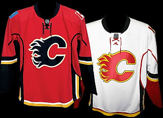
Good to see neither team messed with them much *cough*Islanders*cough*  |
| 89metallicA |
| ||
|
Koopa Level: 26 Posts: 75/113 EXP: 95180 Next: 7095 Since: 02-22-07 From: Ohio Last post: 5998 days Last view: 5924 days |
Calgary's jersey looks good. Is it just me or does the Montreal Away Jersey need some sort of stripe in the middle? It looks a little plain to me... |
| Luigi-San |
| ||
|
Melon Bug Level: 58 Posts: 558/732 EXP: 1569610 Next: 7936 Since: 02-20-07 Last post: 4259 days Last view: 3518 days |
Posted by Acillatem98 Montreal's white jersey has always looked like that |
| Luigi-San |
| ||
|
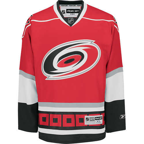
Melon Bug Level: 58 Posts: 559/732 EXP: 1569610 Next: 7936 Since: 02-20-07 Last post: 4259 days Last view: 3518 days |
Well, the Hurricanes unveiled their new jerseys...

 |
| 89metallicA |
| ||
|
Koopa Level: 26 Posts: 77/113 EXP: 95180 Next: 7095 Since: 02-22-07 From: Ohio Last post: 5998 days Last view: 5924 days |
Maybe the Montreal jersey just looks weird to me not being on a player..because now that I think about it..yeah I feel stupid. 
The Carolina jersey, still looking pretty nice. |
| Luigi-San |
| ||
|
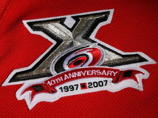
Melon Bug Level: 58 Posts: 566/732 EXP: 1569610 Next: 7936 Since: 02-20-07 Last post: 4259 days Last view: 3518 days |
Speaking of nice...
 |
| Luigi-San |
| ||
|
Melon Bug Level: 58 Posts: 572/732 EXP: 1569610 Next: 7936 Since: 02-20-07 Last post: 4259 days Last view: 3518 days |

I LOVE IT |
| 89metallicA |
| ||
|
Koopa Level: 26 Posts: 85/113 EXP: 95180 Next: 7095 Since: 02-22-07 From: Ohio Last post: 5998 days Last view: 5924 days |
That's pretty damn awesome right there. Should be pretty great, maybe bring in some more fans. |
| Main - Entertainment - The NHL Thread: AB 2 Edition! | New thread | New reply |
© 2005-2023 Acmlm, blackhole89, Xkeeper et al. |
|
MySQL - queries: 102, rows: 124/125, time: 0.013 seconds. |