 |
|


 Main
| FAQ
| Uploader
| IRC chat
| Radio
| Memberlist
| Active users
| Latest posts
| Calendar
| Stats
| Online users
| Search
Main
| FAQ
| Uploader
| IRC chat
| Radio
| Memberlist
| Active users
| Latest posts
| Calendar
| Stats
| Online users
| Search
| |||
| Views: 88,491,265 |
Main
| FAQ
| Uploader
| IRC chat
| Radio
| Memberlist
| Active users
| Latest posts
| Calendar
| Stats
| Online users
| Search
|
04-27-24 05:33 AM |
|
| Guest: Register | Login | |||
| 0 users currently in SMW Hacking | 1 guest |
| Main - SMW Hacking - A few new screens... of SMW2000! | New thread | New reply |
| tt87 |
| ||
 Leever Level: 33 Posts: 38/194 EXP: 214050 Next: 15129 Since: 02-21-07 Last post: 5251 days Last view: 5050 days |
Since I don't want to double post, I'll make a new topic.
I went ahead and fixed up the OW again, adding some trees here and there, and I spruced up the ocean area as well: 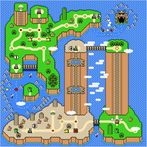
And as for the sub maps, Bowser's Valley got a little help, but Hilly Vale has had a complete makeover (and I'm finally revealing the final two submaps): 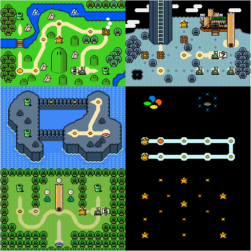
Any comments? Also, I don't know if anyone else is having this problem, but when I finish a level that lets me save (other than the Yellow Switch) the words "Save and Continue" and "Continue Without Save" are invisible. It brings up the box, but the letters are black also. And the two fish around the ocean area don't appear (they make that splash sound however.) Any way to fix that? BTW, if anyone wants a demo, it's still in the other thread. No point making a new demo just to show off what a screen shot can do. |
| fabio |
| ||
|
Level: 65 Posts: 319/945 EXP: 2301559 Next: 34069 Since: 02-19-07 From: Texas Last post: 6032 days Last view: 5543 days |
Excellent job on your new overworld! It's a big improvement over the old one. 
I especially like the Ocean & Hilly Vale submap. To me, it's the most detailed part of the overworld as well as the biggest improvement. |
| Higsby |
| ||
|
Pokey Level: 57 Posts: 151/681 EXP: 1407904 Next: 78024 Since: 02-19-07 From: Canada Last post: 6120 days Last view: 5914 days |
The overworld looks much better now. I really like Star road. I wish I could think of a cool design for mine.
Good job. |
| Luigi-San |
| ||
|
Melon Bug Level: 58 Posts: 104/732 EXP: 1568955 Next: 8591 Since: 02-20-07 Last post: 4254 days Last view: 3513 days |
Is it just me, or are the path colors in the forest submap different? (The levels accessed via secret exit) |
| Sukasa |
| ||
|
Red Birdo Level: 92 Posts: 78/2112 EXP: 7689841 Next: 67096 Since: 02-19-07 Last post: 4448 days Last view: 3220 days |
Yes, there are some colour problems. Trip, thet's just a little detail that's insanely easy to miss, Try checking the palettes of the paths and fixing them to be the same, or just change their palette entries |
| Kles |
| ||
|
Level: 75 Posts: 646/1301 EXP: 3717662 Next: 109242 Since: 02-19-07 From: Canada |
I still think the forest has the coolest design. Nice job! |
| tt87 |
| ||
|
Leever Level: 33 Posts: 39/194 EXP: 214050 Next: 15129 Since: 02-21-07 Last post: 5251 days Last view: 5050 days |
... the forest secret exit path palettes are MEANT to be like that. |
| NightKev |
| ||
|
Cape Luigi Level: 131 Posts: 16/4792 EXP: 26231660 Next: 192960 Since: 03-15-07 Last post: 3735 days Last view: 3647 days |
The screenshots look awesome, although I think the maps/overworld(s) could use a little more "miscellaneous junk" (trees or whatever) on them (but not too much, just a little more, it seems sorta empty to me). ____________________ |
| Sonicandfails |
| ||
|
Lantern Ghost Level: 60 Posts: 73/766 EXP: 1679648 Next: 93130 Since: 02-19-07 Last post: 5965 days Last view: 5771 days |
Whatever happened to SMW1999?
(Hint: Name is pretty bad  ) )
It looks interesting, but that tall left hill side bother me. ____________________ I miss post headers more. |
| S.N.N. |
| ||
|
Beezo Level: 49 Posts: 90/485 EXP: 846183 Next: 37700 Since: 02-19-07 From: Ontario, Canada Last post: 5458 days Last view: 5458 days |
What can I say? You took the criticism given excellently and made your overworlds look great. The main overworld map just looks great now - I detect no graphical flaws
For the 5th submap (forest) it seems to symmetrical to me. Unless this is intended, you should probably kill the symmetry. Other then that, great job. ____________________ Want custom overworld music in your SMW hack? Download this. Don't forget to RTFM. |
| Thexare Blademoon |
| ||
|
Cheep-cheep Level: 32 Posts: 46/180 EXP: 191320 Next: 15122 Since: 02-19-07 Last post: 5965 days Last view: 5958 days |
Minor Detail: The top of the ghost tower looks 2D rather than cylindrical. |
| Dragon Master |
| ||
|
Red Cheep-cheep Level: 34 Posts: 14/217 EXP: 252961 Next: 690 Since: 03-05-07 From: What do you mean with "fad is over"? Last post: 5328 days Last view: 5077 days |
It looks very good and nice but the road in front of the pipe in the beggining of world 6 looks a little iffy. Other then than that very good! |
| FirePhoenix0 |
| ||
|
Bullet Bill Level: 50 Posts: 105/505 EXP: 898833 Next: 48484 Since: 02-23-07 Last post: 5520 days Last view: 5504 days |
I just saw this but are there five switch palaces on those maps? I saw the standard red/green/blue/yellow ones but then on the Special World there's what looks to be a brown one. What's up with that? ____________________ |
| TheGreatGuy |
| ||
|
Beezo Level: 49 Posts: 11/480 EXP: 831533 Next: 52350 Since: 03-15-07 Last post: 5768 days Last view: 5633 days |
It looks like a very well done overworld, definately, I like the really, really, excessively tall mountain  . I also noticed the brown switch, is that just there for decoration(pretty odd decoration though), or did you do something interesting with custom blocks? . I also noticed the brown switch, is that just there for decoration(pretty odd decoration though), or did you do something interesting with custom blocks?____________________ There are things I want to put here. Like a cool picture, my 8-bit theatre character test result, my MS and RO characters... But it's 12 AM, and I'm sleepy. |
| tt87 |
| ||
|
Leever Level: 33 Posts: 40/194 EXP: 214050 Next: 15129 Since: 02-21-07 Last post: 5251 days Last view: 5050 days |
nightkev: will try, but i'm running outta space
sonicandtails: what do YOU suggest i call it? s.n.n.: it's meant to be that way. thexare blademon: i know. it's that way in the original dragon master: it's the best i could do. give me some ideas. firephoenix0: you'll see 
thegreatguy: thx - and for the switch, you'll see
to all: thx for the comments! |
| Phoenix Yoshi |
| ||
|
Red Cheep-cheep Level: 34 Posts: 112/216 EXP: 251495 Next: 2156 Since: 02-19-07 From: Georgia Last post: 5567 days Last view: 5539 days |
Gah! My last post didn't go through! 
The overworlds look nice, but there's a few problems in the main one: 1: The base of all hills/mountains have the pieces that go in the corners where the "edges" are. Look at the one Mario begins on- At the bottom of the lines, it looks like the edges got cut off a bit... 2: The two mountains at the bottom of the overworld look wrong. They look like it's the top of a mountain on a flat surface. Look what you did with the hills at the top of the overworld, then compare them to the mountains- The mountains look like you just threw the "edge lines" on them just for fun. Look at the left-most and right-most "edge lines" on those mountains. There's supposed to be another one of those lines right next to them, to give perspective.
3: There's points in the water where those little "edges" just... cut off. Look to the northeast of Castle #1 and a bit to the right of the right Star Road tile just south of Mario's starting location. There's a bit of wavy water that takes the place of something that should be there. I don't exactly know WHAT to call this tile (The same one I mentioned at #1), so sorry if you have no idea what I'm talking about.
4: South of the pipe in Hilly Vale, you made the bridge be one tile making up part of Bowser's Castle's bridge. That looks wrong. Why can't you use the original bridge? It looks better. :/ 5: Right below the 6th castle, you have the path in the water starting right there next to the land. Don't do that. It looks wrong, because you're actually lopping off part of the wall... So to speak. Plus, to the right of that, part of it just stops all of a sudden. It looks... wrong.... Other than that, your overworlds look great.... Except the Star World one. It looks kinda like you just replaced the ground with... Nothing, and added more level tiles. :/ But then, that's just how it looks from my perspective. I'd probably have a better idea of what it'd be like if you showed what the paths were like... |
| tt87 |
| ||
|
Leever Level: 33 Posts: 41/194 EXP: 214050 Next: 15129 Since: 02-21-07 Last post: 5251 days Last view: 5050 days |
1. I'll try to find them and put them in.
2. Oops! Good eye! 3. I see what you mean. 4. I forgot about that bridge. 5. I can fix the part under the castle, but as for to the right of the boat, there's only so many water path tiles for me to use. And in the Warp Nexus (my name for Star World), the paths are essentially the same as in DW:tLC, but I haven't placed them yet. Star World is still glitchy for some reason. Never fear, they will be fixed in the next demo. |
| Tweaker |
| ||||
|
Red Koopa Level: 28 Posts: 77/139 EXP: 129836 Next: 1502 Since: 02-19-07 From: Rochester, NY Last post: 5795 days Last view: 5702 days |
Posted by Kles Agreed entirely. The whole layout just looks really awesome. ____________________
|
| tt87 |
| ||
|
Leever Level: 33 Posts: 42/194 EXP: 214050 Next: 15129 Since: 02-21-07 Last post: 5251 days Last view: 5050 days |
Has anyone actually noticed what the forest is supposed to look like?
1 hint: think of the theme... EDIT: I just noticed that the two towers CANNOT have the secondary "edge lines" without making them wider. Otherwise, I'll have to remove the pools. EDIT2: That's why the demo is UNLOCKED people. If you see something that needs to be fixed, and I've said that I can't fix it, then you're free to try to fix it. |
| Delpolo |
| ||
|
Level: 30 Posts: 1/160 EXP: 160007 Next: 5862 Since: 03-17-07 Last post: 5755 days Last view: 5216 days |
|
| Main - SMW Hacking - A few new screens... of SMW2000! | New thread | New reply |
© 2005-2023 Acmlm, blackhole89, Xkeeper et al. |
|
MySQL - queries: 117, rows: 156/157, time: 0.017 seconds. |


