 |
| Register | Login | |||||
|
Main
| Memberlist
| Active users
| Calendar
| Chat
| Online users Ranks | FAQ | ACS | Stats | Color Chart | Search | Photo album |
|
| | |||
|
| Register | Login | |||||
|
Main
| Memberlist
| Active users
| Calendar
| Chat
| Online users Ranks | FAQ | ACS | Stats | Color Chart | Search | Photo album |
|
| | |||
| 0 users currently in SMW Hacking. |
| Acmlm's Board - I3 Archive - SMW Hacking - Redrawing every sprite... |
New poll |  | |  |
| Pages: 1 2 3 4 5 6 7 8 9 10 11 12 13 14 | Add to favorites | Next newer thread | Next older thread |
| User | Post | ||
Zachio Knuckle Joe  Since: 11-19-05 From: Q forever Last post: 6463 days Last view: 6462 days |
| ||
| The redness makes the porcupuffer look SO much better. I also love the dolphins. | |||
|
Deleted User Banned Since: 05-08-06 Last post: None Last view: 6431 days |
| ||
Originally posted by Zachio Yeah, they make that they look more angry now  ! ! |
|||
|
eternaldragonx Goomba gtfo Since: 02-18-06 Last post: 6477 days Last view: 6438 days |
| ||
| .....wow.. cant beleive i didnt see this thread i am so astonished opn these new sprites i cant wait to see them and use them in game, icegoom i bow to u my friend.
*eternaldragonx bows at the feet of icegoom and prays for the lord to have mercy on all life forms other than he* |
|||
Radiation UFO  Since: 11-19-05 From: Techno City, The Moon Last post: 6491 days Last view: 6431 days |
| ||
| Augh, I like these sprites a lot. If you release them, try to limit what they can do with them because I don't want them to become the crap cliche that every new SMW hacker uses to make his hack "cool" like the SMAS rips. I'd hate to see your hard work turn into something so terrible... and they probably wouldn't give you credit for the pictures, anyway. | |||
Cirvania Cyball I guess this is as close as Xkeeper will get to spell it right. :< Since: 11-17-05 From: The Island of Puerto Rico. Last post: 6433 days Last view: 6431 days |
| ||
|
@Radiation: No way. Open source is the way to go. Icegoom, after seeing these obscenely awesome sprites, I must say one thing: ALL HAIL ICEGOOM, GOD OF SPRITES! We are not worthy... |
|||
|
Alastor Fearless Moderator Hero  Since: 11-17-05 From: An apartment by DigiPen, Redmond, Washington Last post: 6430 days Last view: 6430 days |
| ||
I walked into this topic expecting people to go gaga over an obvious clash of styles, and saw exactly what I expected. This, however, is not my point.
Originally posted by icegoomThis arrangement is flatly impossible. Big Boo's mouth is drawn and placed on separately, and consists of a 16x16 area. How big is the mouth shown in this shot? 16x18. Are you a simple liar, or is there something I am overlooking? |
|||
Imajin Bot Local Moderator Currently affected by 'No syndrome' ---!!! 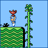 Since: 12-05-05 From: Camineet, Palm Last post: 6431 days Last view: 6431 days |
| ||
| The overall eyes+mouth is 16x32, though, so I suppose the eye tiles were combined with the mouth tiles- I'm not sure if that would work, but tweaked right...
I think the assumption with the clashing styles is that the level graphics will be changed as well- in fact, I believe that point has been raised before in this thread. |
|||
|
Alastor Fearless Moderator Hero Since: 11-17-05 From: An apartment by DigiPen, Redmond, Washington Last post: 6430 days Last view: 6430 days |
| ||
Originally posted by Imajin... Well damn. Still, I have one more thing... The centering of the eyes. Judging by the way he's tiled these with Big Boo being more on the left than on the right and slightly shrunk with a tail added on the right, It would seem to me that the center shot should actually look more like... 
This. Only he'd have arms, presumeably. And the right one would look ridiculous. I didn't bother to add those when drawing this. (So sue me.) Edit: Yeah, I know it's never centered perfectly when turning, but the point is it's not like what he has. (edited by Alastor the Stylish on 03-09-06 09:49 PM) |
|||
|
HyperHacker Star Mario Finally being paid to code in VB! If only I still enjoyed that. <_< Wii #7182 6487 4198 1828 Since: 11-18-05 From: Canada, w00t! My computer's specs, if anyone gives a damn. STOP TRUNCATING THIS >8^( Last post: 6431 days Last view: 6431 days |
| ||
Originally posted by icegoom I think it's just an every-other-pixel-transparent effect. It should be possible, with a bit of ASM tweaking, to apply real translucency to layer 3 instead (though you'd also need HDMA to avoid the scorebar being translucent). |
|||
|
icegoom Cheep-cheep  Since: 03-06-06 From: United States Last post: 6438 days Last view: 6438 days |
| ||
Originally posted by Radiation Well, it does suck when every hack ends up looking exactly the same, but I'm not really expecting these to become all that widespread. This is more about the process of spriting for me anyway. I just like finding ways to fit new images into the space allotted by the game. Originally posted by Alastor the Stylish Originally posted by Imajin Yup, that's it. Originally posted by Alastor the Stylish I just turned off the background and took pictures of Big Boo the way he appears in the game. Here's full screenshots:  
 
If you think I faked those screenshots, I'll have a patch released in a week or so and you can just see the animation for yourself, I guess. Originally posted by Alastor the Stylish Are you referring to the sprites clashing with the background, or are you saying that the style is inconsistent between different sprites? I'm trying to get everything done in a unified style, but I'm working from so many different sources that stuff is bound to clash, I guess. Can you point out specific sprites that don't match with the others? Originally posted by HyperMackerelOriginally posted by icegoom Heh. That's beyond me at this point. |
|||
|
Alastor Fearless Moderator Hero Since: 11-17-05 From: An apartment by DigiPen, Redmond, Washington Last post: 6430 days Last view: 6430 days |
| ||
Originally posted by icegoomThe sprites seem reasonably consistent, although the hitboxes for many do not match the graphics. What I'm mainly commenting on is that the graphical style used for the sprites is completely different from that of the unchanged foreground and background, and it rather looks ugly. (I would also note that the face on the right-facing big boo is futher to the right than the face of the left-facing big boo faces left.) (edited by Alastor the Stylish on 03-09-06 11:53 PM) |
|||
|
Forte.EXE When life seems to get bad, just suck it up and deal with it!  Since: 11-18-05 From: Singe City, Ajiina (Davenport, Iowa) Last post: 6433 days Last view: 6431 days |
| ||
| After going through this thread and taking some time to look at all of the spirtes that are being re-drawn with a GB/GBA fashion like sense, I can say that they are pretty good.
As most people pointed out on different minor subject (which I won't recite), I can see that this seems promising... to say the least. |
|||
The Kins Hoarder  Since: 11-18-05 From: Hurf. Last post: 6445 days Last view: 6431 days |
| ||
Originally posted by Alastor the StylishDunno about you, but I always work on spriting before I do pretty much anything else to a hack.Originally posted by icegoomThe sprites seem reasonably consistent, although the hitboxes for many do not match the graphics. What I'm mainly commenting on is that the graphical style used for the sprites is completely different from that of the unchanged foreground and background, and it rather looks ugly. |
|||
asdf Link's Awakening ಠ_ಠ  Since: 11-18-05 Last post: 6432 days Last view: 6430 days |
| ||
| Hmm...now that I've taken a second look, I noticed that there are going to be many hit detection issues, seeing as how some sprites don't take up the full amount of space anymore. For example, Bullet Bill is only 16x12. Banzai Bill is also too thin. In addition, the stopping animation for the Blue Koopa looks odd; it looks as if he is laying back and it relaxing. And Blue Net Koopas? Huh? | |||
|
icegoom Cheep-cheep Since: 03-06-06 From: United States Last post: 6438 days Last view: 6438 days |
| ||
Originally posted by Alastor the Stylish Those are different frames. Big Boo has four frames of animation: (And of course each is mirrored for when he's facing the other way) Side view, three quarters view, front view, and then bashfully covering his eyes when you face him. I was too lazy to capture the three quarters view for my first standalone image of Big Boo, but I guess there it is in the screenshots. Originally posted by asdf The hit boxes don't really bother me, since that white star thingee that shows an impact sort of covers up where exactly on the sprite Mario's making contact. It's not going to be noticeable on Bullet Bill, but admittedly it might look like Mario's stomping air if you look extremely close while stomping Banzai Bill: 
I like the proportions of Banzai Bill enough that I'm reluctant to make him any taller, though. The hit boxes in this game are already sort of screwed up anyway. Super Mario riding Yoshi has the same sized hit box as small Mario, for instance, so you can get enemies going right through Mario without hurting him sometimes. As for the blue climbing Koopa, yeah, there's no such animal. I was getting the images straight out of YY-Chr and just decided to vary the colors instead of showing all red Koopas. In retrospect, I probably should have shown a yellow Koopa in there somewhere. Anyhoo, here's two options for the Sumo Bros, one making him look like a Hammer Bro, the other running with the sumo theme: 
I made the Hammer Bros. version with a spikey helmet because you can't stomp a Sumo Bro. (The official artwork for the character has no spike on its head, but Nintendo added one to SMW's sprite to indicate that you can't stomp it) I think I like the sumofied version more, but yeah, it's not clear you can't jump on it. I'm not completely satisfied with either of these as they are, so whichever version I choose will get some refining done on it. |
|||
|
Deleted User Banned Since: 05-08-06 Last post: None Last view: 6431 days |
| ||
| The two sumos look great but heres what I think. I think it would be cool and original to use the Hammer Bro. one, plus the graphics on it make it look excellent, but then again, the sumo one still looks really cool and it ties along with the sumo theme. If you want a more Original Sumo brother definently use the hammer one. If though, you do choose to use the other one incorporate the hammer one into another sprite because his GFX look awesome. | |||
|
Deleted User Banned Since: 05-08-06 Last post: None Last view: 6431 days |
| ||
Nice ghosts  . Also, I prefer the Sumo Bros., it´s more original from SMW. . Also, I prefer the Sumo Bros., it´s more original from SMW. |
|||
ZTaimat  260  Since: 11-19-05 Last post: 6497 days Last view: 6431 days |
| ||
| SWEET MOTHER OF!
Jesus, where the hell have I been, and how long has this been open? 
... By any chance can you edit bowsers pallette so he's yellow? Him being green looks tacky, reguardless of how he looks shape-wise. Other than that... *kicks Myamoto in the shin* Thats for making the original SMW 80% shit. |
|||
|
NES Boy Red Paragoomba Since: 02-22-06 Last post: 6671 days Last view: 6671 days |
| ||
Originally posted by andres Which Sumo Bros? The Hammer Bro like one or the more sumo-like one? And here's the Super Mario Sunshine Boo for reference: 
Ignore the error in the texture of the eyes. 
Sorry for being blurry here. We need better pictures of the SMS Boos. I recall them having slightly different tails as well. Anyway, I hope you consider this for the third type of Boo. |
|||
|
Deleted User Banned Since: 05-08-06 Last post: None Last view: 6431 days |
| ||
Originally posted by NES BoyI say Sumo Bros., not Hammer BrosOriginally posted by andres  . . |
| Pages: 1 2 3 4 5 6 7 8 9 10 11 12 13 14 | Add to favorites | Next newer thread | Next older thread |
| Acmlm's Board - I3 Archive - SMW Hacking - Redrawing every sprite... |
| |

