 |
| Register | Login | |||||
|
Main
| Memberlist
| Active users
| Calendar
| Chat
| Online users Ranks | FAQ | ACS | Stats | Color Chart | Search | Photo album |
|
| | |||
|
| Register | Login | |||||
|
Main
| Memberlist
| Active users
| Calendar
| Chat
| Online users Ranks | FAQ | ACS | Stats | Color Chart | Search | Photo album |
|
| | |||
| 0 users currently in Modern Art. |
| Acmlm's Board - I3 Archive - Modern Art - Kirby Layout! |
New poll |  | |  |
| Pages: 1 2 | Add to favorites | Next newer thread | Next older thread |
| User | Post | ||
Lunar MM Simirror  Since: 11-23-05 From: I dunno. Someplace. Last post: 6336 days Last view: 6336 days |
| ||
How does it look?  Thanks to Kirby ATW and Yoshi Dude for helping me with this great layout. Thanks to Kirby ATW and Yoshi Dude for helping me with this great layout.  First, the quote.... First, the quote....
Originally posted by Absolutely Nobody Stretching: S T R E T C H I N G What do ya think? I designed this layout, and KATW and YD helped with the code. (thanks!) Criticism is fine. |
|||
Kattwah Acro RIP Acmlm's Board: Feb. 18 2007  Since: 11-17-05 Last post: 6334 days Last view: 6334 days |
| ||
Well... there WAS supposed to be a textbox around the whole text 
Really, I swear! Then again, Im not too terribly good with textboxes in the first place 
Either way, the font doesnt clash too much right now. |
|||
|
Zem Permabanned. Flaming, trolling, reregistering. Since: 11-18-05 Last post: 6657 days Last view: 6657 days |
| ||
| Looks good. It's legible, but a text box would make it much easier to read. Also, whoever did/does the code, PLEASE make it specify a solid color in addition to a background image. The text is nearly invisible against a dark background, and that's where it'll be if the image doesn't load for whatever reason. | |||
Trapster King Dedede Since: 11-19-05 From: Sweden Last post: 6442 days Last view: 6334 days |
| ||
| He can use the code for my text box if he wants to but I dunno if that one would look good on his layout.
I like it but the blue bg is a little bit bright, though. |
|||
Zachio Knuckle Joe  Since: 11-19-05 From: Q forever Last post: 6367 days Last view: 6366 days |
| ||
To me it looks like there's too many clouds.  Where can you find that many clouds? Where can you find that many clouds?
Yeah... I use auto-updating layouts, and I don't see a dark background, just dark text and light BG. |
|||
|
Alastor Fearless Moderator Hero  Since: 11-17-05 From: An apartment by DigiPen, Redmond, Washington Last post: 6334 days Last view: 6334 days |
| ||
| It's way too light. Looking at it is making my eyes water... | |||
|
Trapster King Dedede Since: 11-19-05 From: Sweden Last post: 6442 days Last view: 6334 days |
| ||
| Maybe he could make it night-themed instead.
With a dark blue sky and some stars on it. |
|||
|
Kattwah Acro RIP Acmlm's Board: Feb. 18 2007 Since: 11-17-05 Last post: 6334 days Last view: 6334 days |
| ||
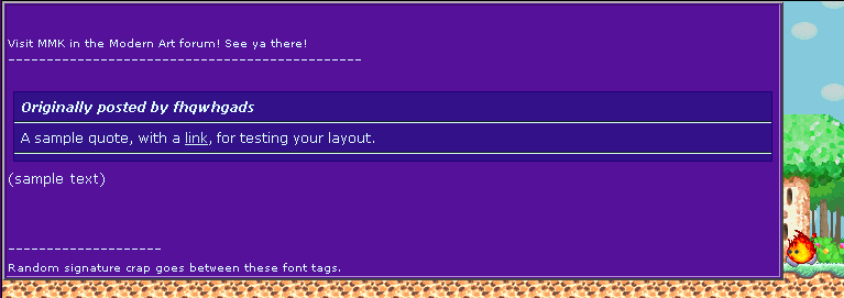
| Bluish purple night background, darkness, and stars added...
Dont mind the fact that the text disappears over the bright stars. That will be fixed when we get this textbox working  |
|||
Danielle     6730 Administratorrrr HELLO THERE   Since: 11-17-05 From: California Rate me ^_^ Last post: 6335 days Last view: 6334 days |
| ||
Guess you fixed it now KATW, cuz it's looking really good in his profile. I like it. Very cute, simple....  |
|||
|
Trapster King Dedede Since: 11-19-05 From: Sweden Last post: 6442 days Last view: 6334 days |
| ||
| I don�t know if I�d call this good.
Is it supposed to look like that? |
|||
|
Lunar MM Simirror Since: 11-23-05 From: I dunno. Someplace. Last post: 6336 days Last view: 6336 days |
| ||
| It's fixed now. How does it look? |
|||
|
Kattwah Acro RIP Acmlm's Board: Feb. 18 2007 Since: 11-17-05 Last post: 6334 days Last view: 6334 days |
| ||
| Well, I would use attachments, but they dont like me... so heres a link instead
Taco |
|||
|
Trapster King Dedede Since: 11-19-05 From: Sweden Last post: 6442 days Last view: 6334 days |
| ||
| I can�t see the "originally posted by" line.
It just looks like some dots up there. Edit: He used attachments? Edit 2: *checks KATW's link* That was better but the bg is a little bit big thought and the textbox is big too. I don�t really mind it, though. Good job. (edited by Ran-chan on 02-03-06 06:32 PM) (edited by Ran-chan on 02-03-06 06:33 PM) |
|||
|
Danielle 6730 Administratorrrr HELLO THERE Since: 11-17-05 From: California Rate me ^_^ Last post: 6335 days Last view: 6334 days |
| ||
| My only complaint would be the unnecessary space in the header and sig. It makes the layout a lot bigger than it really is. | |||
|
Zem Permabanned. Flaming, trolling, reregistering. Since: 11-18-05 Last post: 6657 days Last view: 6657 days |
| ||
| The text goes out the top of the textbox and cuts off for me. Lemme see if I can remember how macs take screenshots.
This only seems to be a problem on lololol on a Mac. I can't test lololol on my PC at the moment. |
|||
|
Trapster King Dedede Since: 11-19-05 From: Sweden Last post: 6442 days Last view: 6334 days |
| ||
| Well, that�s what I meant with my reply.
You guys could try to shrink it a little. Edit: Wtf, I have a PC and I see the same problem. (edited by Ran-chan on 02-03-06 06:42 PM) |
|||
neotransotaku Sledge Brother Liberated from school...until MLK day  Since: 11-17-05 From: In Hearst Field Annex... Last post: 6336 days Last view: 6334 days |
| ||
| also the tree character at the left side, should probably not have his head clipped--other than that, I think it is well done | |||
|
Kattwah Acro RIP Acmlm's Board: Feb. 18 2007 Since: 11-17-05 Last post: 6334 days Last view: 6334 days |
| ||
Originally posted by neotransotakuWhispy woods doesnt have a head... that poor tree  |
|||
|
neotransotaku Sledge Brother Liberated from school...until MLK day Since: 11-17-05 From: In Hearst Field Annex... Last post: 6336 days Last view: 6334 days |
| ||
Originally posted by Kirby ATWI knew it started with a 'W', the name of that tree--okay, if not head, then it's branches shouldn't be clipped like thatOriginally posted by neotransotakuWhispy woods doesnt have a head... that poor tree |
|||
Peardian N-Z KvSG #193 is up!  Since: 11-17-05 From: Pearl Island Last post: 6335 days Last view: 6334 days |
| ||
| I don't think you ever see Whispy Woods' top in KDL3. he might have to improvise.
And the night theme is cool. (edited by Peardian on 02-03-06 07:07 PM) |
| Pages: 1 2 | Add to favorites | Next newer thread | Next older thread |
| Acmlm's Board - I3 Archive - Modern Art - Kirby Layout! |
| |
