| User | Post |
Sketchie
Posts: 14/356 |
Originally posted by Kyouji Craw
That... Would be difficult. I'd have to do quite a bit of editing to the palette, and the graphics, to make that look good =/
Honestly, it looks a lot better in the emulator at full size.
Then I guess I can't really complain about it. It's not my hack after all.  |
Alastor the Stylish
Posts: 4517/7620 |
That... Would be difficult. I'd have to do quite a bit of editing to the palette, and the graphics, to make that look good =/
Honestly, it looks a lot better in the emulator at full size. |
Sketchie
Posts: 13/356 |
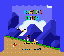
It's kinda hard to tell the difference between the blue background and the blue border. 
Hm... you know what would be cool? Since you already have that border that somewhat resembles curtains, why not "copy" the SMB3 curtains into it? If you don't want to, maybe make your own curtains or something. Or even maybe a black line around the border to help people tell the difference between the blue background and the blue border. |
Alastor the Stylish
Posts: 4516/7620 |
Well that level isn't really accessable in the actual game - there's a modified version of it as a secret level, but it doesn't have those buzzsaws (because you can kill them by sliding at them, and that killing them causes a graphical glitch since they weren't meant to be killable) and a few of the parts are easier.
Also...  |
Sketchie
Posts: 12/356 |
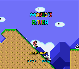
That's quite evil - having a buzzsaw (what is it again??) near the end of the hill. XP
It looks good so far. Keep up the good work. |
Alastor the Stylish
Posts: 4505/7620 |
I can't. It has to be on the bottom line or it covers Mario during the demo during several points =/
EDIT:  |
HyperLamer
Posts: 2933/8210 |
Make it 2 lines, both positioned where the game will draw the menu overtop of them.
...PRESS
...START |
Alastor the Stylish
Posts: 4492/7620 |
Alright, fine. I'll work on using it, instead. I tried to use it from the start but it turned out there wasn't enough space for it, but, I can try again and again to balance the font and the spacing until it works. |
Aioria
Posts: 1245/1567 |
sorry, but the 'press A message' idea doesn't look so cool, 'press start' would be much better.
edit: i dont remember pressing A at the title screen either  |
Alastor the Stylish
Posts: 4479/7620 |
Well actually, any button except L and R will bring up the menu, but... |
Juggling Joker
Posts: 461/1033 |
Press A? I don't think I've ever pressed A on the start menu. |
Alastor the Stylish
Posts: 4474/7620 |
Well, I changed the title screen. Right now there is no border though I'll work on a new one fairly soon, probably that's similiar to the one right now but not with black and white stripes (on account of everyone hating it.) I also added some text saying "Press 'A'!" conveniently located in a place that doesn't obscure the intro movie and which goes away when you do so. |
AtmaDragonXT
Posts: 39/84 |
With the right colors I think it'd have potential, but right now... *shudders* |
TheCube
Posts: 11/82 |
Am I the only one who likes the title screen? The diagonal stripes are...well, they're not pretty, but I still like them. |
Xkeeper
Posts: -2695/-863 |
Or he could just keep you drooling for a release. Most released demos aren't demo-type stuff, they're usually just the beginning of the game with the rest chopped off. 
But yes, change the title screen. Arrhg, it burns. |
Aioria
Posts: 1242/1567 |
ok i know you probably answered this already, but since i was too lazy to read the entire thread, here comes the question> any idea for a demo release? *makes puppy eyes* |
KATW
Posts: 2392/3959 |
1: No complaints
2: Darker Palette = Rock!
3: BG... maybe a bit too blue...  Good none-the-less. Good none-the-less.
4: Nothing Wrong
5: Please tell me you are changing the ? block animation 
6: Mmm... Cavey. FG clashes with BG a bit.
7: Nothing wrong
8: Blue BG just does not work with water levels.
9: Water.
10: Ghost...
11: Shy guy 
12: MY EYES THEY BURN! Please... no diagonal stripes 
I see everything has improved... All except the still-flat status bar  Needs more color. Needs more color.  |
PumpkinPie
Posts: 34/1158 |
Cool Ghost House gfx, totally awesome. Actually, all of the graphics are awesome...except the title screen. You might want to consider changing that. Well, I see some nice cameo appearances from ravens and bloopers. Good jorb. |
Alastor the Stylish
Posts: 4456/7620 |
Thanks for your input, everyone. Some of your comments have been taken in to consideration 
Also, the little walking eyeball is called Eyetite... It's a cross between Eye and Tektite, which was the first thing that came to mind when Chris said he thought it was from Zelda. |
Cruel Justice
Posts: 545/1384 |
Bad:
-The blue mountains look a bit contrasty
-The shot with the head needs some decoration to liven the scenery
-The lights need more of a gradiation. Right now it can easily be mistaken as a glitch.
-The underwater scene lacks decoration and a background more less. I could understand the problem if you were using layer 3 however.
Good:
-Wow, you're actually making up some sprites! Eyeballs are fun, and squishy!
-The head was a creative idea
-The YI graphics were pretty nicely assembled
-The change in letters shows that effort has been put into the hack |
| This is a long thread. Click here to view it. |


