| User | Post |
Sukasa
Posts: 1977/1981 |
Major problems... I hope I don't give myself a major heart attack when I work on al this...
- Status bar GFX: Fixed.
- Status bar arrangement: Working
- Bowser Station GFX: Working
- Danger Pass GFX / Palette: Working
- OW GFX: Working
- OW Palettes: Working
- Bowser Station BG: Working
- Pipe Land BG: Fixed
- Koopa Subs: Working
- Cacti: Working
All-in-all, that's about 2 good weekends of work, counting in other distractions.
That's why I likke your input, GP. You're methodic and notice a lot of things. |
HyperLamer
Posts: 8022/8210 |
Originally posted by Glyph Phoenix
HH, don't be stupid. If you can't tell the difference between the general title of "Space Station" and a fuel tank tileset with extremely similar tiles, then I pity you.
Shit, that's right. I forgot I was supposed to notice every single tiny detail and memorize exactly what someone else's screenshots from several months ago look like and compare every single screenshot I see to every other screenshot I've ever seen. How the hell did I forget that? |
Glyph Phoenix
Posts: 688/745 |
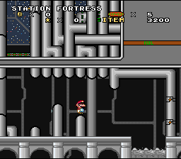
Lessee here, my first couple of posts didn't have near enough content so I'm going to give a solid rundown of what you should do now, since you were kind enough to not freak when I pointed out what you should work on. Beware; the remainder of this post will get hairy but if you follow my advice your graphics could go up several levels of awesome. Which you really need since they really don't look very good.
In the space station the gray pipes don't match the existing SMW archway. Either change the archway to be like the pipes or the pipes to be like the archway otherwise it looks funny. Your background pipes are also too small. They should be big enough to have detail or gradients or some other such otherwise they too look funny.
Gray up the alpine summit walkways. They are too vivid the way they are. And there are too many dots in your main snowy dot tiles. Take a look at the two-eyed hills, can you see how many dots they have and how it looks different from your snow tiles? Make them match. And make the water less vivid while you're at it.
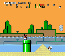
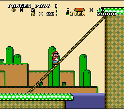
Your danger pass is also too vivid. And there should be no bottom outline on the green background ledges. You might want to try for a more pastel orange-brown-green palette as well; it would look less annoying.
The danger pass background pipes don't have a proper gradient. It goes from dark green straight to a really light green and it looks bad. Fix it. And there should be dithering on the water in the BG to make it look more like water and less like... some sort of blue ground.
I'd like to take a moment to say that Dark Ludwig's 'realness' comment makes me sick. The cactus doesn't look anything like a cactus, your background was already used in Demo World if I recall correctly. The top of your FG ground also has this weird dark rounded look that does not work to your advantage.
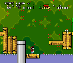
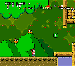
The pipe land berries are too vivid; they should be bigger and of a duller color. The branches hanging off the logs should be of the same kind of the log and not the entirely different looking forest palette style.
The multicolored track in Bowser station does not look good. And those... things... are just plain bad. Remember, if you can't do an enemy that looks as good as or better than the original graphic, then for the love of ROM, don't change it. It applies especially to enemies since they always follow the same pattern.
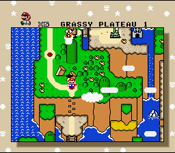
Grassy plateau, again, there should be less dots in the ground. The colors are really rather vivid; I'd put in gradients or turn the brightness down a notch where you get a chance.
And I guess with all the other stuff popping up I was just too lazy to mention how nasty your status bar looks cluttered like that. The colons look awful, there's way too much space between icons, the X, and the number, and if that white coin in the corner is a dragon coin meter I should remind you that they should be gold.
How you fix the status bar is up to you, but if you're totally lost, here's a few tips. You might want to try aligning the coins and the star; I know the star can't be moved but the coins can. Move the lives all the way over to the right so they're right on top of score.
You've been cool about this, but man, you've got some major problems with this hack. |
Sukasa
Posts: 1971/1981 |
Thanks, GP. I know that tileset a lot like BMF's, but I kinda wanted to add in that tileset, to complement the power generation, H2O storage, and air storage parts of the station. Completion, I guess. |
Glyph Phoenix
Posts: 687/745 |
HH, don't be stupid. If you can't tell the difference between the general title of "Space Station" and a fuel tank tileset with extremely similar tiles, then I pity you.
Shyguy, I pity you too but for far more obvious reasons so I won't even list them.
And Sukasa, most people would say something stupid in this situation, but you didn't. Way to be. |
Sukasa
Posts: 1969/1981 |
Space buttom? What do you mean by that? I suppose the 'fuel' indicators were ripoffs... but I had the OXY and H2O indicators first! Oh, and GP isn't an asshole, he's just being honest, and is one critic I really appreciate, because he almost always finds something that I can work on to make better. People like him really do help a lot. |
SoNotNormal
Posts: 736/793 |
That was an interesting idea with the space station - but it WAS in that first part of SMO - wonder what kinda of GFX I'll need for TTYD's Palace of Shadow . . .
Doesn't look like your space buttom is working Sukasa  |
Sukasa
Posts: 1967/1981 |
eh? Try redownloading the file, cuz freewebs sucks ballsfor downloads.
I'm going to reduce thenumber of red dots and spread them out, though. |
HyperLamer
Posts: 7985/8210 |
You can't have a space station without it being a ripoff of BMF's? 
Those red dots do need to go, though. |
Shyguy
Posts: 1910/1998 |
Here's whats wrong:
We're not deliberatly trying to be assholes! 
Actually, I know where your coming from with the misplaced red dots in the forestry levels. 
But everything else is fine! |
Glyph Phoenix
Posts: 686/745 |
Ugly red vivid dots in the background and one changed log intersection net a picture 10/10? An ugly BMF ripoff earns a "Cool"?
What the hell is wrong with you people? |
XxShaynee2xX
Posts: 94/102 |
i downloaded the patch, but when i patched and tried to play, it wont load right. Do i have to expand the rom or something? |
Sukasa
Posts: 1957/1981 |
Oh, right... I'll make some animated tiles for that. I also redid that status bar's Mario/Luigi counter, and finished the GFX for the item box, and it looks muuuuuch better. No screenies of it though, my other computer's off. |
elixirnova
Posts: 176/177 |
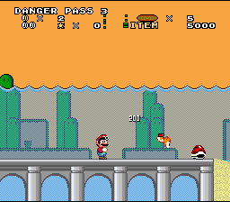
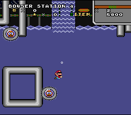
On that last pic, very much need to add some of that gray bubbly stuff under the bridges. Or make it more convincing that the gray bubbly isn't out of place like it looks there. |
HyperLamer
Posts: 7960/8210 |
Cool. Shouldn't there be mud below those arches though? |
Sukasa
Posts: 1950/1981 |
Noted, I'm, working on your suggestions.
In the meantime, one other shot...
 |
BMF98567
Posts: 1228/1261 |
Not bad, but get rid of that ugly ((M)) thing in the status bar. It looks like either a deflated football or something I wouldn't dare smoke.  |
asdf
Posts: 290/303 |
Camera? I thought it was a sniper rifle.
01 - Great, no problems here.
02 - The tides make it look weird with the background.
03 - Same.
04 - Background is plain, but good otherwise.
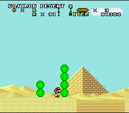
05 - Odd lava.
06 - This has great potential, but for some reason (probably the brightness) I just don't like it.
07 - If I didn't know any better I'd say the background caught STDs
08 - See above.
09 - See above. The linked logs look great.
10 - Nothing much to say here.
11 - The "invisible paths" look strange, as does the world. Cool, though.
12 - Very nice! The top right reveals minor blandness, but it doesn't matter much.
13 - Great design. |
Dark Ludwig
Posts: 163/172 |
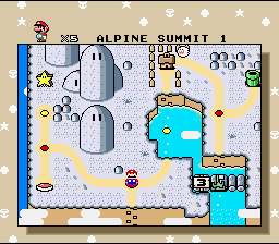
So this is the top of a snow-capped mountain? Well it's not OMG-awesome, but certainly not in the range of bad. No flaws, at least I can't see any. I don't feel that ExGFX is in need here, since it already looks nice. I don't rate according to creativity unless it's bland, but rather on flaws, so 10/10.
Pretty good, but background could use a little more detail and some clouds. Foreground looks real nice, at least the landscape. 9/10.
^^^Ditto. 9/10.
^^^Ditto. 9/10.
^^^Ditto, but with ugly FG palette! And the FG takes up half the screen! 7/10.
^^^Ditto, but this time less of the ugly ground and better landscape. Nice idea with the lava. 9/10.
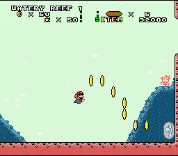
I never was fond of water levels.  But I can still tell that the backdrop color is way too light IMO, and that it could use a little more graphics than underwater hills for the BG. Bland, too, as are 90% of water levels. 7/10. But I can still tell that the backdrop color is way too light IMO, and that it could use a little more graphics than underwater hills for the BG. Bland, too, as are 90% of water levels. 7/10.
I like the concept of berries in the BG! And the foreground isn't too shabby, wither. 10/10.
^^^Ditto. 10/10
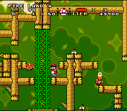
Very creative! I like the log maze. 10/10
This gives me such a great sense of realness that I want to jump in and be a part of it. 10/10.
This is simply THE BEST overworld I have ever seen. Flawless, ExGFX, this gets a 10/10.
Koopa submersibles? This is a nice picture, and nice concept. 10/10.
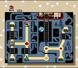
Could a flawless and creative overworld get anything less than a 10/10? 'Cause that's what this gets. I also like the lakitu with the camera!
OVERALL:
-½ for the *slight* lack of possible graphics in the BG.
-¼ for the green in the "M" indicator in the status bar. Please make the letter thicker, and with a different color.
-¼ for your water level having a bland foreground.
Combined, I give you a 9/10 for your hack. Well done!  I can't wait for the release. I can't wait for the release. |
Xkeeper 2.0
Posts: 1020/1091 |
Not too bad.
Though... are you adding HDMA effects to this? |
| This is a long thread. Click here to view it. |


