| User | Post |
Sukasa
Posts: 1578/1981 |
Originally posted by Danielle
Looks good Keikonium. Much better than your name on it in big letters. 
Although I really think that last one Sakusa made was pretty good. Oh well. 
Yeah, the nice thing is that they're for different games... I can use them both. I'd tell you who "they" are, but that'd ruin the whole plot of more than just COTMK 2, COTMK 3 and some of COTMK 4 would be ruined too. |
Peardian
Posts: 1092/1696 |
That looks good, but who's "they"? |
Danielle
Posts: 1461/3359 |
Looks good Keikonium. Much better than your name on it in big letters.
Although I really think that last one Sakusa made was pretty good. Oh well. |
Keikonium
Posts: 2243/-2459 |
Is this one better:
 |
Sukasa
Posts: 1563/1981 |
I would appreciate that kei. I hate not giving credit where it's deserved. |
Keikonium
Posts: 2181/-2459 |
HH is right Darkflight. I should re-do the image and put what he said.
Personally I don't even want credit for the image seeing as it was a favor. I don't like signing my art work either. But if you don't want to accept it without credit to me, I can edit in "image by keikonium" somewhere. |
HyperLamer
Posts: 6220/8210 |
If you put 'Keikonium' in the image, it's going to look like he made the hack.  Unless you just put 'Image by Keikonium' in a small font somewhere. (See the 'sloganizer.net' in the image in my sig for an example.) Unless you just put 'Image by Keikonium' in a small font somewhere. (See the 'sloganizer.net' in the image in my sig for an example.) |
Sukasa
Posts: 1505/1981 |
Thanks, but Keikonium has already signed up for that one... Maybe I'll see if you can do COTMK 3? (like that's ever gonna come out this decade) |
Violent J
Posts: 498/749 |
Something simple an nice is what really makes something stand out. Sorta like thesethis (Seems the other banner is not in my Photobucket  ) ) these (I lied..I found it) banners I made for Golden Yoshis almost completed hack.

If you want Sukasa, I can make you a banner. I have been making banners like monthely now for hacks and site, so you might want to catch me while im still in the mood!
|
stag019
Posts: 201/299 |
I like the one without your name. I think those are better than the knew ones. |
Sukasa
Posts: 1500/1981 |
 Nice, but it would be a good idea to keep the (psd?) file file around a bit, I might have something else in store for where "the adventure continues" is. Nice, but it would be a good idea to keep the (psd?) file file around a bit, I might have something else in store for where "the adventure continues" is. |
Keikonium
Posts: 2097/-2459 |
Here is the one with my name: 
And here is the one that doesn't have my name: 
Your choice. |
Sukasa
Posts: 1497/1981 |
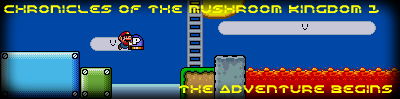
...Finally. Kei, I'm going to take you up on your offer (but for COTMK 2), but you have to credit yourself with it for it to be used, K? |
Keikonium
Posts: 2094/-2459 |
We have a winner!! That one looks good, the text is readable, and its from COTMK1 . .
Great job, you have it now ! !
~EDIT~
If you want, I still have the .psd for the one I made. I can make it say 2 instead of 1, or whatever else for your second hack. If you want it, just let me know. |
Sukasa
Posts: 1492/1981 |
All right, I'll try again. Kei, yours looks great except for one thing- you used a screen from COTMK 2, not COTMK 1.
EDIT: If this one isn't good, I'm going to ask kei to make me one because Fireworks just ended it's trial period.
 |
Danielle
Posts: 1223/3359 |
In all of them, they're difficult to read. Choose a simple font, a good color that will show up against the image, and keep it simple. Yours all seem so busy.. the text is the worst part though. If you look at Keikonium's, his text is legible, which is nice. The black on black is a stretch for readability though, I think.
You could definitely make a good one, just try keping it simpler than what you're doing now. And most importantly, make it readable and clean. |
Snika
Posts: 313/916 |
Sukasa, I think your going for the wrong effect. You shouldn't make logos too busy with too many images. Keikonium pointed you in the right direction with using one screenshot and readable text.
I think you could get it Sukasa if you tried again. The last one was an improvement.
=P Snika |
KATW
Posts: 3306/3959 |
Youre going for something way too fancy Sukasa. Simple, and easy to read is what everyone likes.
Go with something like Kei here. No fancy fonts, no weird graphic changes, something eye catchy and pretty, while still being readable. It can easily be made in paint to be good.
Honestly, the first two, I thought that was your signature  |
Keikonium
Posts: 2092/-2459 |
Perhaps I wored myself wrong . Yes you have in-game images, yes they are clear (except the big invisible Mario), and yes nothing severly contrasts, but this is not looking great. It's cluttered, it's messy, it just looks like a quick paint cut and paste job with an invisible mario overtop of it. . Yes you have in-game images, yes they are clear (except the big invisible Mario), and yes nothing severly contrasts, but this is not looking great. It's cluttered, it's messy, it just looks like a quick paint cut and paste job with an invisible mario overtop of it.
Look here, I made you a quick banner:

This took me about 10 minutes to make. Use it if you would like to. No credit required (I just want to try out your hack when it gets released!) |
Sukasa
Posts: 1483/1981 |
Well then, how's this?

I changed the text, and used screens from in-game instead of LM like you'd suggested. |
| This is a long thread. Click here to view it. |


