Acmlm's Board - I2 Archive - Super Mario World hacking - Upcoming hack.
| User | Post |
Wirtzzz
Posts: 6/24 |
I think that it looks really nice but will it be hard or is it an easy hack? but will it be hard or is it an easy hack? |
Koneko
Posts: 3/256 |
This is looking pretty awesome!
Just so you know, I'm looking at these from new to old.
Recent pics:
The FG is really good, great patterns on the hills, although the green hilltops look like they are in front of the hills, if you know what I mean... I think I'm being unclear, somehow...
Did you change the status bar palette on purpose?
The trees in the BG seriously need to be recolored. Unless you have some explanation for why the trees are purple and yellow, they shouldn't be. The rest of the BG is great, though.
As for the title screen, it amazes me. The font is awesome.
Older...
FG Ground patterns are good. Overworld looks slightly bland, and could use more random decorative stuff scattered around.
Archaic...
First level shot: Very good, the block has a nice feel to it. FG and BG hills are neat, and I love the psychadelic palette for the BG.
Next: Really cool BG. The evil mushrooms look sufficiently evil, and I like the diagonal pipe, because almost no one ever uses it.
I've already looked at the third one I believe...
4th: Nice BG again, and the Shy Guy looks good next to the Mario 3 cave ground.
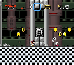
Last: Wow! The BG looks good, and the one thing I don't love is that the floor takes up half of the screen... the checkerboard pattern is a little boring. I suggest adding a pattern to the tiles so that it isn't quite as monotonous.
All in all, this is looking great, keep up the good work!
ExKeeper
Posts: 340/512 |
Originally posted by Ice Man
More colors and a better design of the FG.
BTW: It's selfmade. 
nice FG GFX |
Juggling Joker
Posts: 906/1033 |
Originally posted by The Kins
You're dead to me now.
And you had such a loving relationship before, right? 
Personally, I really like the look of the trees in the screenshot in question. The only problem I see is that there is way too much empty space in the bottom portion. Ways to fix this are to add more doodads to that part of the background (hard to do, yeah, but possible) or to shift the entire thing downwards (a lot easier). I would recommend at least trying both to see which you like better. |
The Kins
Posts: 515/595 |
Originally posted by prophetz
smb2 is the worst game ever made
You're dead to me now. |
prophetz
Posts: 3/3 |
smb2 is the worst game ever made why would you want to use it's graphics ESPECIALLY the crappy main sprite! I think this hack is looking fking elite! nice d d |
Ikuzou
Posts: 58/181 |
The animated lightning is cool, I like it -
but maybe This lightning is good too.
Originally posted by Glyph Phoenix
I like the new font and the background changes. But are you ever going to fix the trees in that second BG? Because that is and always was the worst looking part of it.
Sorry, but agreed.
Just tweak it a little so it has shadows, leaves, etc.
No offense, just suggesting, please understand...
|
Glyph Phoenix
Posts: 280/745 |
I like the new font and the background changes. But are you ever going to fix the trees in that second BG? Because that is and always was the worst looking part of it. |
ExKay
Posts: 760/1114 |
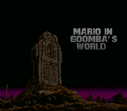
Another update of the title screen and the ground from SS#4 has been done.
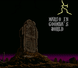
New font only, but it looks better.
More colors and a better design of the FG.
BTW: It's selfmade. |
Glyph Phoenix
Posts: 272/745 |
I didn't want it to fade into black, I wanted the checkerboard pattern to start incorporating transparent tiles into... Gah. I'm going to have to make a picture, aren't I?

Pretend teal is the background and that the checkerboard pattern looks remotely like the one in the screenshot. |
Keikonium
Posts: 1341/-2459 |
I think that would look even worse Glyph Phoenix. If you really wanted to do something to the floor so it doesn't run the same all the way down, is have it fade into black, and not a harsh transition into black. I think that using about 8 colors would do the job.
Comments on the new screens:
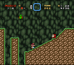
1. This level still looks way to empty. The BG looks like something from a NES game too . If you want to keep that BG, fix the palm trees (the yellow bits on it), and maby make them ummm....green!? The hills and mountains are green, when they should be grayish-brown. And the forestry is brown when it should be green. The clouds look really good however. . If you want to keep that BG, fix the palm trees (the yellow bits on it), and maby make them ummm....green!? The hills and mountains are green, when they should be grayish-brown. And the forestry is brown when it should be green. The clouds look really good however.
2. Letters look better, but still not all that great. I suggest a more "fitting" font. You have a dark vamperial type looking screen, with bright bubbley letters. Maby something more gothic and pointy would look better? The lightning is a good idea. Its bright, but it flashes and fades out right?
3. The overworld looks nice, kinda empty, but nice. And oh my god, there are no graphic glitches !! VERY good job at that! !! VERY good job at that!
Again, this hack looks nice. Keep up the good work. |
Glyph Phoenix
Posts: 270/745 |
I don't get why you guys like the mushrooms. They don't look good. Especially the text bubble.
Pretty much all ripped graphics except the poorly paletted brown bush screenshot (which the clouds do help a little) look really great.
Now here's my big suggestion: Change the checkerboard floor. For the top checkerboard looks fine, but when it runs all the way down like that it looks pretty bad. You know what would look really nifty? If the checkerboard floor looked like... welll... Lemme ascii something up for you...
BWBWBWBWB
WBWBWBWBW
B B B B B B
Y'know, sorta like the bottom breaks up and disappears so you're standing on a floating floor. That way it doesn't repeat through half of the screen. |
Sukasa
Posts: 860/1981 |
looks great, except that in the OW, the perspectives for the lake there don't match up. for most of it you have wat meets grass, but on the sides, the water meets ground. |
ExKay
Posts: 758/1114 |
I made a small update for the title screen and screen #4 + and OW shot.

As you can see, I added clouds to the BG, which makes the look of it a lot better, at least IMO.

I fixed some letters a little bit and I added animated lightings.

And the Overworld.
Comments, please.
|
Golden Yoshi
Posts: 465/693 |
Man, that is one damn good-lookin' hack you got there.
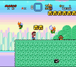
1st screen: That looks really awesome and well-done, nothing to complan about here.
2nd screen: Very good too, not really that crazy about the BG because it isn't as detailed as the others, but that's the only reason, it still looks great.
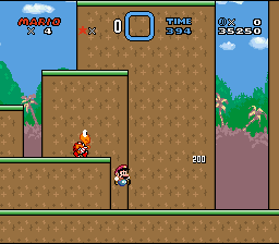
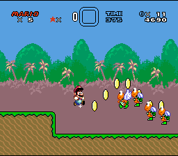
3rd screen: A magnificently beautiful BG, especially the trees, they're very detailed and vivid and catch your eyes. Great job! Those lil' dudes at the bottom look cool too, what are they?
4th screen: I agree with Sky Troopa, the BG is a bit odd. What I think the problem is that all parts of the BG are too light, so there isn't really any kind of contrast, which makes it a bit dull. You want to add more of a contrast to the colors in the hills and trees probably.
5th screen: Everything looks fine here.
6th screen: Another beautiful BG, one that catches your eye.
From what I see here I am looking forward to playing a demo. You seem to have graphics down-packed, but I hope your level design is of equal or greater quality to your graphics. I have faith that it will though . |
Skytroopa
Posts: 86/175 |
Sky Troopa attack:
Not bad.
Nice brick block.

Nice BG. Mushrooms are good.
For me is this BG a bit odd.
Not bad.
Cool BG.
Final comment: This hack like realy interesting. Good work. |
ExKay
Posts: 757/1114 |
I will add some clouds to the BG of screen #4.
About the OW, it's not even started, so there are no screens. |
Ikuzou
Posts: 51/181 |
AWESOME! Keep it up!
The storyline is pretty good too.
Some suggestions:
(+) The pipe on the 3rd ScreenShot doesn't really go with the FG/BG, you should change the pallete.
(+) Maybe you should add more stuff on the BG of SS#4.
(+) How does the OW look like? We want to see!
(+) Maybe some plants in the FG would look nicer.
Otherwise, it looks very good. Any demos?
|
ExKay
Posts: 756/1114 |
Thanks for all your comments. I already made some changes and will get some screens as soon as possible. |
TheCube
Posts: 46/82 |
I had to refresh the page to load the first screen. It loaded partway, but then mysteriously broke.
I really don't like the first screen at all. I mean, it looks awesome, but Dracula's grave really doesn't seem to fit. Something original would be nice, but something ripped that seems to fit the atmosphere better would be good too.
Also, I have to agree with Keikonium in saying that the letters look a bit...odd. They're too plain-looking to have the asymmetrical look work for them. (Of course, that somehow applies to letters that aren't symmetrical. How? Hell if I know. They just kinda look...squished.) You might wanna draw them either more plainly, or with more flourish.
Otherwise, looks good to me. |
| This is a long thread. Click here to view it. | |
|


