 |
|


 Main
| FAQ
| Uploader
| IRC chat
| Radio
| Memberlist
| Active users
| Latest posts
| Calendar
| Stats
| Online users
| Search
| |||
| Views: 88,482,010 |
    Main
| FAQ
| Uploader
| IRC chat
| Radio
| Memberlist
| Active users
| Latest posts
| Calendar
| Stats
| Online users
| Search
|
04-25-24 02:04 PM |
|
| Guest: Register | Login | |||
| 0 users currently in ROM Hacking | 1 guest |
| Main - ROM Hacking - The General Project Screenshot/Videos Thread... | New thread | New reply |
| frantik |
| ||
|
Red Koopa Level: 28 Posts: 121/139 EXP: 127396 Next: 3942 Since: 10-09-07 Last post: 4488 days Last view: 4482 days |
  
getting close now.. only like 2 levels needed to complete.. might even see a late 2009 release 
|
| zbyte |
| ||
|
Boomerang Brother Z is Superior! Level: 66 Posts: 443/1016 EXP: 2386958 Next: 74893 Since: 06-10-09 Last post: 4431 days Last view: 2910 days |
Frantik, those screenshots look awesome. Can't wait to see more! Good luck with the rest of your project! 
Mineyl, all of those graphics look awesome, but the bridges don't look right... they sort of go into the water. But that's definitely more than what I could do. 
And since this is the home for screenshots... The Brink...  ____________________ No quotes found; we apologize for the inconvenience. Commas, question marks, and semicolons are available, though. |
| Insectduel |
| ||
|
Hammer Brother Level: 68 Posts: 447/1069 EXP: 2687571 Next: 41229 Since: 02-16-08 From: Insectduel's office Last post: 1256 days Last view: 1255 days |
Awesome map screen zbyte. |
| Mineyl |
| ||
|
Ninji Level: 35 Posts: 80/243 EXP: 276845 Next: 3091 Since: 09-10-09 From: World 5 Last post: 4277 days Last view: 462 days |
@Frantik: I'm really digging those screens. SMB1's graphics were so atrocious that I honestly get excited every time I see any kind of graphical upgrade at all for it. xD
@Zbyte: I like how your world map starts on the right and goes left instead of the traditional SMB3 way, but I think it looks a tad bit too linear. I'm sure the same could be said of my maps, though, so I can't really call the kettle black here, but I do encourage you to mix it up a little more. :3 Also, is that second fortress near the end castle linked to any locks or bridges? Also, my bridges look fine to me. I wish I could give them a bit bigger of a shadow, but that's just the limitation of the 16 x 16 boundaries. They're supposed to be a more traditional wood and rope bridge; y'know, the ones in movies and old cartoons where the bad guys ALWAYS manage to corner the good guys and cut it down, leaving them suspended from the cliff?  I think the "dip" is justified, as if you look at the cliffs leading from the land into the water in SMB3, they're fairly high. I think the "dip" is justified, as if you look at the cliffs leading from the land into the water in SMB3, they're fairly high.____________________ Back from the beyond. |
| frantik |
| ||
|
Red Koopa Level: 28 Posts: 122/139 EXP: 127396 Next: 3942 Since: 10-09-07 Last post: 4488 days Last view: 4482 days |
Posted by Mineyl thanks  (and thanks zbyte too (and thanks zbyte too  ) there's a lot more than simple graphic changes made though ) there's a lot more than simple graphic changes made though  |
| MathOnNapkins |
| ||
|
Super Koopa Level: 62 Posts: 717/842 EXP: 1935375 Next: 49311 Since: 02-19-07 From: durff Last post: 4487 days Last view: 4010 days |
Latest BRRAmp build:
Just have a handful of features to add before it's complete. ____________________ Zelda Hacking Forum hobbies: delectatio morosa |
| zbyte |
| ||
|
Boomerang Brother Z is Superior! Level: 66 Posts: 458/1016 EXP: 2386958 Next: 74893 Since: 06-10-09 Last post: 4431 days Last view: 2910 days |
Posted by MineylOkay, I get it now. Words cannot describe how good [your] graphics are! 
Posted by MineylI'm not sure what you mean by "too linear" here. The path isn't crooked enough? Well, a map is what I do best. Thanks for your comments.  
Edit: Forgot the second fortress.  ____________________ No quotes found; we apologize for the inconvenience. Commas, question marks, and semicolons are available, though. |
| boingboingsplat |
| ||||
|
Giant Koopa [PREFSTRING:wonderful bounciness] Level: 74 Posts: 1048/1292 EXP: 3633461 Next: 20083 Since: 07-23-07 From: Michicola Last post: 4841 days Last view: 4803 days |
|
| Mineyl |
| ||
|
Ninji Level: 35 Posts: 82/243 EXP: 276845 Next: 3091 Since: 09-10-09 From: World 5 Last post: 4277 days Last view: 462 days |
@Zbyte: Yeah, Boingboing gets it. It's not that your paths aren't adequately curved; it's just that there's a noticeable lack of branching paths. Branches are good. 
I actually like your second map a lot more than the first. I love how you've mixed up the locations on the map, giving the player less of a sense of direction than usual. No real suggestions other than what I mentioned above. :3 Oh, and speaking on my bridges/graphics... I hope I didn't sound too conceited. It's just that when people challenge what I make, I usually try to defend what I did and give the thought process that went into its creation. You'd be surprised how much time I sit meticulously messing with this stuff to get it to look *just* right.  I aim to please. I aim to please.____________________ Back from the beyond. |
| DarkPhoenix |
| ||
|
Micro-Goomba Level: 12 Posts: 19/19 EXP: 6511 Next: 1410 Since: 05-24-07 Last post: 5299 days Last view: 5286 days |
@Mineyl: I kind of see what zbyte means with the bridges. It's kind of hard to explain, and I know what you're going for, but they kind of grab my eyes.
I'll try my best to explain why I think it's this way. The original graphics have kind of a flattened 3/4 view, and the original bridges, which arc upward, hold to that, as you can see the top of the bridge, as well as directly under the bridge (delineated by the shadow). It's a little hard to pull that (3/4 view) off with bridges that arc down, at least with such little space. Notice the bridge in never-obsolete's first screen shot - it works, and it would continue to work if it arced down slightly, only because you can distinctly see the side of the bridge, as well as the shadow under it, which tells your eyes the correct way to perceive the bridge (particularly because of the contrast between the light color of the bridge and the dark color of the shadow, which aids in giving the impression of depth). On your bridges (and I don't mean this to be critical in any way) there is no shadow, and there is also no color contrast (insofar as the shadow), and so my eye has no immediate frame of reference to decide how to perceive the bridge, and so my immediate impression is that the bridge is actually upside-down. Here's a few suggestions that might help: A: Don't arc the bridges so much, and add a shadow (esp. since a short bridge won't arc much); B: Use a higher concentration of lighter colors on the front side of the bridge than the back; C: If you want to keep the bridge arced as it is, make another special water tile below the bridge, to add the shadow. Here's A&B:  Maybe darken the middle cross-beam to make it look like it's arced just a little more. Not sure if that's all too far from what you're going for, but I hope it's helpful. Maybe darken the middle cross-beam to make it look like it's arced just a little more. Not sure if that's all too far from what you're going for, but I hope it's helpful.
Also, you may want to tone down the green of the grass just a little if you can (not sure if you can on the NES). It might just be my screen, but it seems a touch bright to me. Otherwise, absolutely awesome. Excellent work. |
| Mineyl |
| ||
|
Ninji Level: 35 Posts: 83/243 EXP: 276845 Next: 3091 Since: 09-10-09 From: World 5 Last post: 4277 days Last view: 462 days |
Erm...thank you, Dark. I'm not used to people posting such huge responses to me. I'm actually blushing. 
Since a second varied opinion has popped up on the bridges, I'll try tinkering with the graphic a bit more. Thank you for your concerns. The reason the colors might be bugging you is because I actually take all these screenshots with VirtuaNES, but when I threw the palettes into the game, I was using FCEU, which has a slightly darker (and better, in my opinion) palette. Here's a comparison: VirtuaNES: 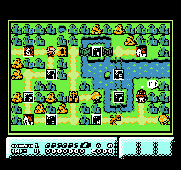
FCEU: 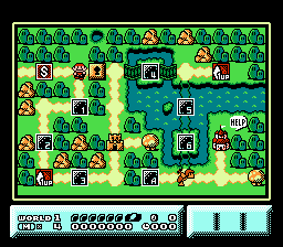
Side-by-side:   ____________________ Back from the beyond. |
| kuja killer |
| ||
|
Level: 55 Posts: 126/628 EXP: 1243789 Next: 70400 Since: 03-20-07 From: Lake Havasu City, Arizona Last post: 281 days Last view: 6 days |
That's pretty cool mineyl.  When i look at the better screenshot with the slightly darker-ness, i got this strange thought in my head that the screen feels as if it's taking place in the afternoon time around 2-3 PM When i look at the better screenshot with the slightly darker-ness, i got this strange thought in my head that the screen feels as if it's taking place in the afternoon time around 2-3 PM  |
| Mineyl |
| ||
|
Ninji Level: 35 Posts: 84/243 EXP: 276845 Next: 3091 Since: 09-10-09 From: World 5 Last post: 4277 days Last view: 462 days |
Thanks, KK.  I honestly prefer the "coolness" of FCEU's palette. I only used VirtuaNES for screencaps 'cause I actually knew where those screens were being saved to. xD Horrible reason, I know. I honestly prefer the "coolness" of FCEU's palette. I only used VirtuaNES for screencaps 'cause I actually knew where those screens were being saved to. xD Horrible reason, I know.
From now on, I suppose I'll take screens with FCEU. It'll probably be for the best. ____________________ Back from the beyond. |
| Trelior |
| ||
|
Level: 99 Posts: 613/2602 EXP: 9754750 Next: 245250 Since: 07-12-09 Last post: 4496 days Last view: 4483 days |
Mineyl: FCEU screen shots are saved by default in .\snaps by default. |
| Dr. Hell |
| ||
|
Lakitu Level: 52 Posts: 520/552 EXP: 1026409 Next: 57431 Since: 03-02-07 From: Pittsburgh, PA Last post: 5033 days Last view: 4990 days |
First off Mineyl, that overworld is really pretty, I like it. Secondly, is that the Rondo of Blood 1-up icon? If so, even more awesome. |
| Mineyl |
| ||
|
Ninji Level: 35 Posts: 86/243 EXP: 276845 Next: 3091 Since: 09-10-09 From: World 5 Last post: 4277 days Last view: 462 days |
@Trelior: Yeah, I changed the directory after finding the tab for doing so. Thanks. 
@Dr. Hell: Good eye. xD Yes, it's based off of the 1-up sprite in Rondo of Blood/Dracula X, 'cause those are the most awesome 1-up graphics. Ever. It's only based on it, though; I made it a point to not copy anything other than the general gist of the idea. Thought it'd work well. 
EDIT: Took the advice given and altered the bridges:  ____________________ Back from the beyond. |
| Googie |
| ||
|
Giant Red Paratroopa Level: 77 Posts: 567/1407 EXP: 4180808 Next: 10321 Since: 02-19-07 From: Brooklyn, NY Last post: 8 days Last view: 8 days |
Smooth screenie, I thought it was a SNES game too... ^^; ____________________ My Linktree |
| zbyte |
| ||
|
Boomerang Brother Z is Superior! Level: 66 Posts: 491/1016 EXP: 2386958 Next: 74893 Since: 06-10-09 Last post: 4431 days Last view: 2910 days |
Maybe I'll start with a few here. This is a beginning of a level.
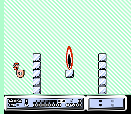 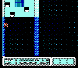 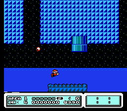
I don't know why the clouds in the second shot are looking like that. There is supposed to be a small Cheep-Cheep in the third. Edit: Maybe the colors should change. How about you? 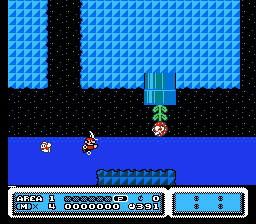 ____________________ No quotes found; we apologize for the inconvenience. Commas, question marks, and semicolons are available, though. |
| Really Snooky |
| ||
|
Micro-Goomba Level: 11 Posts: 15/18 EXP: 5735 Next: 250 Since: 11-14-08 Last post: 5252 days Last view: 5245 days |
The flame in the first looks weird connected to the ice (remember, fire melts ice). Isn't the wall (not the cloud) cutoff in the second, third, and fourth shot? What about the pipes in third and fourth? They look awkward like that. ____________________ |
| Insectduel |
| ||
|
Hammer Brother Level: 68 Posts: 460/1069 EXP: 2687571 Next: 41229 Since: 02-16-08 From: Insectduel's office Last post: 1256 days Last view: 1255 days |
These are the results after messing around with Matrixz's Capcom Sprite Assember. Introducing the Rockman 6 Buster Charge in my Mega Man IV hack. And a few other ASM stuff. Some coding like the Wind, Fast Scroll and the Fade are from Rock5easily. Not me.
Pharoah Man's Tileset still needs to be assembled as it loads somewhat different along with other Megaman tiles. |
| Main - ROM Hacking - The General Project Screenshot/Videos Thread... | New thread | New reply |
© 2005-2023 Acmlm, blackhole89, Xkeeper et al. |
|
MySQL - queries: 124, rows: 163/166, time: 0.032 seconds. |