|
|


 Main
| FAQ
| Uploader
| IRC chat
| Radio
| Memberlist
| Active users
| Latest posts
| Calendar
| Stats
| Online users
| Search
Main
| FAQ
| Uploader
| IRC chat
| Radio
| Memberlist
| Active users
| Latest posts
| Calendar
| Stats
| Online users
| Search
| |||
| Views: 88,434,992 |
Main
| FAQ
| Uploader
| IRC chat
| Radio
| Memberlist
| Active users
| Latest posts
| Calendar
| Stats
| Online users
| Search
|
04-19-24 07:31 AM |
|
| Guest: Register | Login | |||
| 0 users currently in Modern Art | 3 guests |
| Main - Modern Art - Ooooh, Photoshop Magic... | New thread | New reply |
| FirePhoenix0 |
| ||
|
Bullet Bill Level: 50 Posts: 61/505 EXP: 898266 Next: 49051 Since: 02-23-07 Last post: 5513 days Last view: 5496 days |
I'm in Computer Graphics 1 at my school and I thought I'd show off what I've done recently. (I had to size them down from 1500X1200 pixels and 1200X1500 pixels, respectively, so that's why some parts of them look pixelated.)
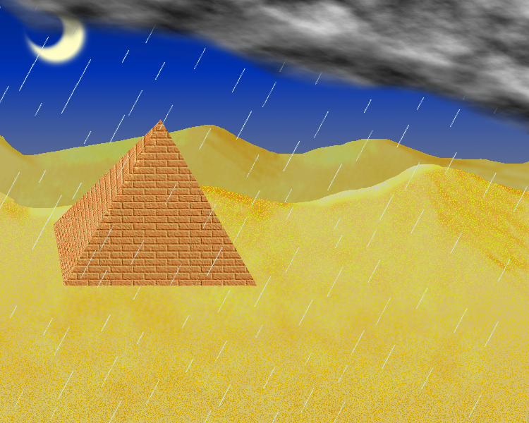
I call it "Desert Rain Landscape." We were assigned as extra credit to make a landscape using Wacom Tablets. It started as just a desert but then it became night. And then I decided to have it rain. All in all, I think it came out pretty well. 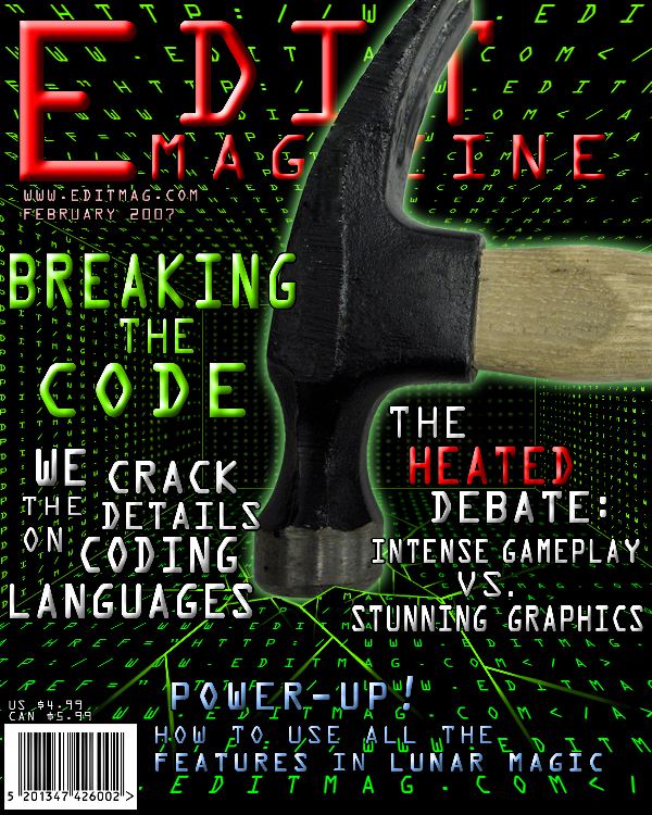
This was a graded project. We had to make a magazine cover and I chose Rom Hacking as the topic. I really like the finished product. I'm not sure how much the teacher does (He's an asshole.) but the rest of the class did. In the planning stages, I was going to make the main article about Lunar Magic and have a picture of myself carrying the SMW blocks into place instead of using a mouse to point and click. ____________________ |
| setz |
| ||
|
Spike fuck~ Level: 58 Posts: 52/722 EXP: 1536026 Next: 41520 Since: 02-19-07 From: Pittsburgh, PA Last post: 5283 days Last view: 2570 days |
on the first one, the only thing that keys off nighttime is the sky; the sand and such looks like the middle of the day.
The magazine looks pretty sloppy, as if things were just thrown around, but I guess thats how they do it these days. ____________________ |
| Laplace's Demon |
| |||||
|
Bloober One over s minus a :> Level: 47 Posts: 42/440 EXP: 730687 Next: 35516 Since: 02-20-07 From: Puerto Rico Last post: 5266 days Last view: 5247 days |
|
|||||
| cpubasic13 |
| |||
|
Lakitu Level: 52 Posts: 67/555 EXP: 1035242 Next: 48598 Since: 02-19-07 From: Citra, Florida Last post: 6008 days Last view: 4439 days |
|
| Hiryuu |
| ||
|
Done. Level: 79 Posts: 146/1471 EXP: 4467016 Next: 112451 Since: 02-19-07 From: ??? Last post: 6079 days Last view: 6072 days |
I'll just cut in and say that you have an okay concept for a n00b. I mean I was practically the same way when I started messing around with Photoshop just for kicks. However, you will get better than that with a lot of practice. To be frank, it's really not that good but it shows that you're at least trying somewhat to understand what Photoshop has to offer, which a lot of people do when they're starting out.
You can find an ASSLOAD of tutorials on the internet for Photoshop. Browse them at your leisure when you want to perform a particular thing and can't figure out how. With me, I did it that way instead of trying to digest a large load of concepts all at once. It eventually helped too. I'll show you an evolution on a project for StepMania that has somehow not yet died for me: If you're not aware, SM would be a Dance Dance Revolution simulator for the PC. Well you can also make your own songfiles with graphics and steps and such. I had a remix of a song (made by Bouche) that was NEEDING to be made for SM. At the time, however, I had an excessively limited knowledge of graphics and didn't know -wtf- I was doing half the time. I mean just for shits and giggles, I'll show you the first I ever did on my own for the whole SM business: OMG: 
Not great at all. This was just an attempt at something I didn't understand a tenth of. Here's what I had to work with as a base for the remix: 

These are from the original DDR 1st. They're not half bad when you look at them. Consider that this is what you're looking at when you select the song and the background that shows when you're mashing arrows on the pad. Here's where we start with what I did with it: 2005 (1st attempt): 

Well, I'm certainly de pro.  
Anyways, here's another shot a year later after messing with stuff off and on: 2006 (2nd attempt): 

Little better. You can tell I ripped some elements off the first one but not too much. The background is actually a half and half take from Respect but you wouldn't be able to tell unless you looked at it. However, that was still not enough for me and probably won't ever be if I put a fourth down but I did do another one just recently... 2007 (Most recent attempt): 

A ton better. Completely from scratch. It's not the most perfect concept in the world but it's a hell of a lot better than when I started. It's not an exceptionally graphic piece of work but it does show that it's starting to get a little more sophisticated than when I started even using the original concept the entire time. That's just to give you an idea of what can happen when you put a lot of practice into the program. This isn't my best work but it's a good example of how you can come along with stuff like this. Yea, I'm done ranting that I'm mediocre. :\ |
| The Kins |
| ||
|
Paratroopa Level: 28 Posts: 33/140 EXP: 131155 Next: 183 Since: 02-19-07 From: AUSSIELAND Last post: 5905 days Last view: 5905 days |
Posted by FirePhoenix0Holy fucking Smartfilters, Batman! I recommend listening to Hiryuu, he has his head on his shoulders. |
| Kles |
| ||
|
Level: 75 Posts: 380/1301 EXP: 3715316 Next: 111588 Since: 02-19-07 From: Canada |

I went overboard. |
| FirePhoenix0 |
| ||
|
Bullet Bill Level: 50 Posts: 63/505 EXP: 898266 Next: 49051 Since: 02-23-07 Last post: 5513 days Last view: 5496 days |
Thanks for the comments and stuff.
I probably should've eased up on the bevel and emboss for the magazine text. Unfortunately, the project is over but if I have time when I'm assembling my final project (a compilation of all the projects throughout the year) I'll try to change some of the things suggested. As for the desert landscape, I haven't turned it in yet so I can fix some stuff before submitting it. I really need to get Photoshop for myself but it's WAY too much $$$ to spend on it. I wonder how the CS3 Beta is? That's free right? If I could get that I could teach myself with some tutorials, but until then, unless I write down the tutorial or bring it in on my flash and try to teach myself stuff in class, I won't be getting far. The teacher doesn't let anyone on the Internet. And Hiryuu, I do know what SM is. I have it on my computer. It's pretty fun to play around with every once in a while. I have an image I made with Bryce 5 that I could show too. It's at school now but I could show it tomorrow. It's my first real attempt at using the program so of course it'll be pretty n00bish. ____________________ |
| Mervill |
| ||
|
Shyguy Level: 23 Posts: 51/87 EXP: 64248 Next: 3475 Since: 02-19-07 From: The Moon Last post: 6223 days Last view: 6216 days |
Posted by Kles Woa, thats pretty kool looken...... 0_o |
| FirePhoenix0 |
| ||
|
Bullet Bill Level: 50 Posts: 69/505 EXP: 898266 Next: 49051 Since: 02-23-07 Last post: 5513 days Last view: 5496 days |
This is the first image I made with Bryce 5, so I basically have very little clue about what it can do and such. I also realize that the area between the mountains and house is pretty empty and that the lake is way too circular to be natural but I'm just starting to learn it as I've said.
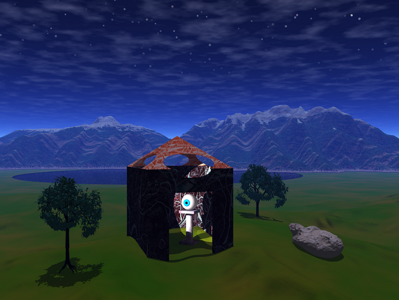
Look! This must be where the eye from Super Mario 64 lives!  ____________________ |
| Main - Modern Art - Ooooh, Photoshop Magic... | New thread | New reply |
© 2005-2023 Acmlm, blackhole89, Xkeeper et al. |
|
MySQL - queries: 72, rows: 90/91, time: 0.017 seconds. |