 |
| Register | Login | |||||
|
Main
| Memberlist
| Active users
| Calendar
| Chat
| Online users Ranks | FAQ | ACS | Stats | Color Chart | Search | Photo album |
|
| | |||
|
| Register | Login | |||||
|
Main
| Memberlist
| Active users
| Calendar
| Chat
| Online users Ranks | FAQ | ACS | Stats | Color Chart | Search | Photo album |
|
| | |||
| 0 users currently in SMW Hacking. |
| Acmlm's Board - I3 Archive - SMW Hacking - Redrawing every sprite... |
New poll |  | |  |
| Pages: 1 2 3 4 5 6 7 8 9 10 11 12 13 14 | Add to favorites | Next newer thread | Next older thread |
| User | Post | ||
|
Deleted User Banned Since: 05-08-06 Last post: None Last view: 6432 days |
| ||
I checked out all of the sprites of yours, icegoom, and that is awesome with a capital "A". |
|||
|
Alastor Fearless Moderator Hero  Since: 11-17-05 From: An apartment by DigiPen, Redmond, Washington Last post: 6432 days Last view: 6432 days |
| ||
Originally posted by Rawk Hawk 64Wha? Oh, and the map looks... Grainy. Certainly, a style which isn't bad normally, but it's rather inconsistent with that of the sprites elsewhere. |
|||
|
Deleted User Banned Since: 05-08-06 Last post: None Last view: 6432 days |
| ||
Originally posted by Alastor the StylishOriginally posted by Rawk Hawk 64Wha? Grainy, Chalky, it has a very "Yoshi Island/Yoshi Story" look which is very cool! |
|||
|
Chris Spiny Since: 11-17-05 Last post: 6542 days Last view: 6542 days |
| ||
I am certainly delighted by your work, icegoom. Now I realize why this thread has so many post in it.  Great WORK! It all looks awesome. Great WORK! It all looks awesome. |
|||
|
Alastor Fearless Moderator Hero Since: 11-17-05 From: An apartment by DigiPen, Redmond, Washington Last post: 6432 days Last view: 6432 days |
| ||
Originally posted by Skyon... But out of style with the everything else.Originally posted by Alastor the StylishOriginally posted by Rawk Hawk 64Wha? (edited by Alastor the Stylish on 04-08-06 09:06 PM) |
|||
|
Cruel Justice I have better things to do. Since: 11-18-05 From: At my house! Last post: 6432 days Last view: 6432 days |
| ||
| All your graphics have a sort of RPG-esque quality. Reminds me of some random RM2k Chipsets I used to download.
Need I say anymore? *points* This guy's got MAD skillz! He's a fucking madman! Ahhhh!!!!  |
|||
Imajin Bot Local Moderator Currently affected by 'No syndrome' ---!!! 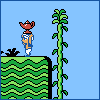 Since: 12-05-05 From: Camineet, Palm Last post: 6433 days Last view: 6432 days |
| ||
| I don't think it's that bad to have the world map be a different style than the levels, as long as the two don't overlap. | |||
timdevril50755 Poppy Bros. Jr Since: 11-17-05 Last post: 6442 days Last view: 6432 days |
| ||
| I like any of these graphics, as long as they're custom...
These are completely awesome though. Almost makes me want to hack again, even though I never officially stopped. Didn't want to make another "I'm Quitting" thread. This forum was bad enough already before it was deleted. I do like having everything the same style, OW and levels. It's like having a LTTP overworld (awesomeness still) and DKC level GFX Experience graphics people could make it work, but not so experienced... (edited by timdevril50755 on 04-07-06 01:10 AM) |
|||
|
icegoom Cheep-cheep  Since: 03-06-06 From: United States Last post: 6439 days Last view: 6439 days |
| ||
Originally posted by THE ONE That's sort of what I tried to begin with, but I thought the ropes looked too long between the planks on the distant end. Nintendo drew the bridge in a weird perpsective that doesn't match the rest of the environment, so maybe I ought to just switch them over to a complete side view instead of trying to show the top of the boards at all. Originally posted by Alastor the Stylish As far as the overworld goes, I figured that I was doing all the sprites in sort of GBA style, so I might as well find a GBA Mario game that had an overworld and draw inspiration from that. Mario Golf had one. So I was trying to keep a consistent style, but yeah, Mario Golf is a lot different stylistically from other GBA Mario games. I'm capable of drawing graphics completely from scratch, but stuff looks more Mario-esque when I have some reference to work from. Originally posted by Yoster Yeah, I'm not that fond of the blue in cliffs, but had to have blue for the water and my other palette slots were filled with grass and dirt shades, so that's what I had left to do shadows with. It might look better if I desaturate things... Originally posted by Forte.EXE Originally posted by NES Boy I'm sort of surprised that people like the top Peach sprites more. I drew those originally without much in the way of reference, just trying to match what I'd already done with her popping out of the Clown Car. But then I started thinking the proportions looked off, (Peach normally has a tiny head compared to her body) so I sort of resized Mario Party Advance's Peach sprite and tried to cram it in the alloted space. It's Nintendo's fault for not making Peach tall enough. She towers over Mario and Luigi these days. Small amounts of progess: Morton, Roy, and Ludwig: 
Drew breathing animations for Morton without really thinking through what I was doing, but didn't do Roy. I really need to change the palettes on these guys. I tried doing Morton a couple of weeks ago, but I couldn't get it to work right. While I'm on the subject of the Koopalings, does anyone know how to fix the palettes and tile mappings of this screen in the ending?: 
Here's some more random objects: 
Speaker box (barely changed), coin dropped by cloud when Yoshi eats 2 pink berries, balloon, bubble, parashoot. And some random enemies to go with them: 
Diagonal Podoboo and a rather headless Puntin' Chuck. Originally posted by lynch82 I'm pretty sure I'm entirely done with him now, although I'm iffy on the climbing and dying frames: 
Here's a preliminary font: 
I think the letters are too skinny, so I believe I'll try to fatten them up some. And finally, the Mask Koopas and Pidget Bill from after beating Special World: 
Heh. I never got around to changing the orange in that palette. Not terribly pleased with these. I was trying to make it look like the koopa's wearing an oversized mascot head and is having trouble seeing where it's going, but it didn't work so well. Mask Koopas are actually shorter than normal Koopas, so I had to cram that much more detail into a smaller space. Pidget Bill is basically the same as its Mario Advance incarnation. Oh yeah, I'm showing the shell replacements, and I realize I never actually bothered to show what normal shells look like:  |
|||
|
BMF54123 Since: 11-18-05 From: MOOGLES Last post: 6432 days Last view: 6432 days |
| ||
Originally posted by icegoomHAHAHAHAHAHA. Don't you DARE change those, I love them.  |
|||
|
Deleted User Banned Since: 05-08-06 Last post: None Last view: 6432 days |
| ||
I love your mask koopas after the Special World ! Great work  . You did it again . . You did it again . |
|||
|
Deleted User Banned Since: 05-08-06 Last post: None Last view: 6432 days |
| ||
IceGoom's got MAD spriting skillz! A+! they look like what they do in the Mario Gamecube games! |
|||
Chris Leonhart Waddle Dee  Since: 11-18-05 Last post: 6727 days Last view: 6449 days |
| ||
It's been a while for me, and I notice that I never got around to commenting on this. Anyway, so far, this is looking really good, although I feel the OW palette could use some darnkening. The colors appear to be the much brighter GBA-style coloring than the more conservate, easier to look at colors formatted for a TV, or in this case, a monitor. The only other thing I have to mention, is this:
Originally posted by icegoom Luigi's head looks...off. Like his neck isn't properly connected to the rest of his body, and his head should just roll off at any moment. |
|||
|
Mattrizzle Red Goomba  Since: 11-17-05 From: Louisville, KY, USA Last post: 6730 days Last view: 6730 days |
| ||
| About changing the palettes:
At 1DF6E-1DF70 change the bytes to: 84 CC A4 and at 1DF73-1DF75 change the bytes to: B3 B3 B2 This should make Morton gray, Roy pink, and Ludwig blue. Changing these bytes makes Morton and Roy use two palettes that are normally unused in the game, while giving Ludwig the default blue palette. If you want to edit these palettes in Lunar Magic: Morton's palette is palette number F in Sprite Palette 4. Roy's palette is palette number F in Sprite Palette 7. Btw, Roy's head should be the same color as his shell. The palette Bowser uses on the ending screen is palette number E in Sprite Palette 7. Here's the info I posted on the ending tiles: Originally posted by Mattrizzle If there's something you don't understand about this, don't hesitate to PM me. |
|||
|
Glyphodon Since: 11-18-05 Last post: 6473 days Last view: 6453 days |
| ||
| Speaking of blue for Ludwig, you should do that for his sprite. He just doesn't look right gold. | |||
|
Mike O'Shay Red Koopa  Since: 03-16-06 From: Mushroom Kingdom? Last post: 6631 days Last view: 6432 days |
| ||
| Those new Mask Koopas KICK ASS! They look exactly like Koopas trying to pass off the image of being Mario. | |||
Mr. Saturn Bronto Burt 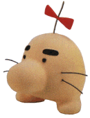 Since: 03-28-06 Last post: 6437 days Last view: 6432 days |
| ||
| I must say, all of these are great. I don't like the blue line parts in the overworld, though.
I especially like these Mask Koopas. They almost look like drunken Marios O_o Are you planning on working on the Jack-O-Lanterns, too? |
|||
|
icegoom Cheep-cheep Since: 03-06-06 From: United States Last post: 6439 days Last view: 6439 days |
| ||
Originally posted by Mr. Saturn Yep, I'll do something to them. I'd also stick sunglasses on the Goombas, but then parashooting Goombas would look really odd when they touched down. Originally posted by Chris Leonhart Ha ha! You're right. The render I was working from had Luigi standing with his arms and legs all splayed out, and when I moved them in closer to the body, I should have changed the head's position, too. Originally posted by Mattrizzle Ooh, thanks! That couldn't have been more clearly explained. Koopalings with proper palettes:   
Now, to get to work on that ending screen... Here's a few odds and ends: 
Spikes, wooden stakes, castle bridges. Meh. Alternate style for a turn block: (compared with old one on the right)  
This might look better than the old one, but it doesn't really match the style of the other blocks I've done. New Dry Bones throwing frame, since the old one sucked: 
Hmm... What I have left to do before I think I'll release something: The rest of the Chuck varieties Lemmy and Wendy Fix Overworld Palettes Foreground for Cave/Underwater and Forest ... And I'll probably also come across a lot of other stuff I still want to change, so I'm not setting any concrete deadlines. Heh. |
|||
|
Mike O'Shay Red Koopa Since: 03-16-06 From: Mushroom Kingdom? Last post: 6631 days Last view: 6432 days |
| ||
| Nice new Dry Bones sprite. I think it would be easier to compare the two turn blocks if the second one also had a clear background when turning, like the first one does, for a more even contrast between them. With the blue background on the one to the right, it just seems too... crammed. | |||
|
Mattrizzle Red Goomba Since: 11-17-05 From: Louisville, KY, USA Last post: 6730 days Last view: 6730 days |
| ||
| If you want to make Iggy green, his tile attributes (palette, tileset, flip, etc.) are located in the range 1D42E-1D49C. Just change the lower digit of each byte that ends in 5 to B, while leaving the higher one as it was. The tile attributes for his decoys are at 1D4A0-1D4B4.
For Wendy, you can either choose to leave her red (as in SMB3), or change her to pink (her official artwork). Her attributes are at 1D4B8-1D526. Each low digit of 9 here can be replaced with F. This pink palette is palette F of Sprite Palette 1. Wendy's decoys' attributes are at 1D52A-1D53E. Keep in mind that in the ending, Wendy may have to share palettes with Roy, unless you edit the teal palette that was used for Buzzy Beetle (seems to be the better option, as the Buzzy Beetle now uses the blue palette anyway.) Edit: It turns out that the tiles that make up Wendy's bow are jumbled when she looks around. To fix this, replace the strings at these addresses with the following: 1D1AF: 08 1D1B5: 08 1D3D7: 1F 1E 1D3DD: 1E 1F (edited by Mattrizzle on 04-08-06 09:04 AM) |
| Pages: 1 2 3 4 5 6 7 8 9 10 11 12 13 14 | Add to favorites | Next newer thread | Next older thread |
| Acmlm's Board - I3 Archive - SMW Hacking - Redrawing every sprite... |
| |


