 |
| Register | Login | |||||
|
Main
| Memberlist
| Active users
| Calendar
| Chat
| Online users Ranks | FAQ | ACS | Stats | Color Chart | Search | Photo album |
|
| | |||
|
| Register | Login | |||||
|
Main
| Memberlist
| Active users
| Calendar
| Chat
| Online users Ranks | FAQ | ACS | Stats | Color Chart | Search | Photo album |
|
| | |||
| 0 users currently in ROM Hacking. |
| Acmlm's Board - I3 Archive - ROM Hacking - A Super Mario Bros hack... |
New poll |  | |  |
| Pages: 1 2 | Add to favorites | Next newer thread | Next older thread |
| User | Post | ||
Shiryu Gungun  Since: 02-24-06 Last post: 6432 days Last view: 6430 days |
| ||
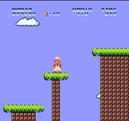
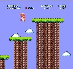
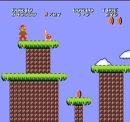
| I know there are thousands of hacks of this game, but whatever.
I'm making a Super Mario Bros hack with new graphics, some of them are custom by me, and others are edited from other games. here are some screenshots (the stages are not edited, I'm working on the tiles): 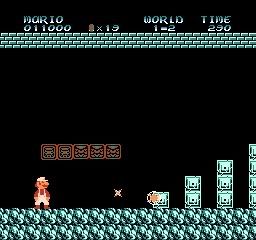
those weird blocks over mario looks bad becouse the frame they are. 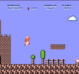
that cloud was pain to make... =_= 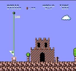
a castle. 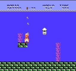
notice that the color of the text has changed to a depper blue ^^ 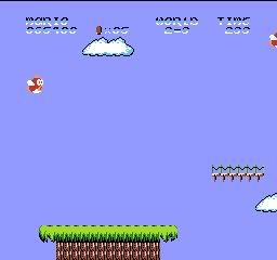
Islands and a bridge (Mario is invisible becouse i got hit accidentally by one of those stupid red fishes...  ) )
more islands (they look better in the game...) Please comment and tell me how to improve ^^ |
|||
Dragonsbrethren   440  Since: 12-01-05 From: New Jersey Last post: 6618 days Last view: 6618 days |
| ||
Nice graphics  |
|||
|
The Onyx Dragoon 150  Since: 11-17-05 From: Somewhere between Mars and Jupiter, Sitting on an Asteroid Last post: 6435 days Last view: 6432 days |
| ||
| I agree. However, the text is a bit too bright...It works very well with a black backround, but otherwise, not the best.
(Mabey UZI should start taking some notes.) |
|||
|
Shiryu Gungun Since: 02-24-06 Last post: 6432 days Last view: 6430 days |
| ||
| actually i have to do something with the text becouse in world 3 half of it is invisible... But the font looks so cool...
And the ? blocks (well... they aren't ? anymore) they look crapy without a black background... |
|||
asdf Link's Awakening ಠ_ಠ  Since: 11-18-05 Last post: 6432 days Last view: 6430 days |
| ||
| I like it. It's quite creative. The bright spot on the trees is one thing I see wrong, though. It sticks out quite badly. The only other problem is the aforementioned text, which looks horrible while not underground. | |||
Metal Knuckles Tendoru  Since: 12-21-05 From: New Hampshire Last post: 6430 days Last view: 6430 days |
| ||
Originally posted by The Onyx Dragoon SUBLIMINAL MESSAGING!!! XP Those teal blocks in the first pic look a little too... teal. Perhaps a darker shade would make them look better. Also, the brown rocks you got in the floor tiles might look better at a more red shade. Am I correct in thinking you got those from TLoZ? Otherwise, good work. Editing the lighter shade the text goes to into something that's still different then the blu but of a darker shade might work as well. |
|||
|
Shiryu Gungun Since: 02-24-06 Last post: 6432 days Last view: 6430 days |
| ||
No, I got them from little samson XD but I had to change them to mach smb pallete. 
This is how the "?" blocks look with the animation. |
|||
The Kins Hoarder  Since: 11-18-05 From: Hurf. Last post: 6444 days Last view: 6430 days |
| ||
| The font looks terrible, and the white lines on the treetrunks look odd, but apart from that it looks fairly nice. | |||
|
Shiryu Gungun Since: 02-24-06 Last post: 6432 days Last view: 6430 days |
| ||
I changed the trees and the font.
I had a problem while editing the font. If you are going to edit it, don't change the tile 00009000 (that dot next to the 0) becouse it crushes the game at the title screen. |
|||
|
Dragonsbrethren 440 Since: 12-01-05 From: New Jersey Last post: 6618 days Last view: 6618 days |
| ||
| For all the people complaining about the colors, it looks like he didn't touch the palettes, he's just using a different one than you. | |||
|
Shiryu Gungun Since: 02-24-06 Last post: 6432 days Last view: 6430 days |
| ||
| yes, I didn't edit palettes. I use BMFPAL or something like that.... | |||
|
Dragonsbrethren 440 Since: 12-01-05 From: New Jersey Last post: 6618 days Last view: 6618 days |
| ||
| BMF's palettes mimic what the NES displays (on my TV) very good, so you should keep using it. Most people use fX3's palette, which is supposed to be very accurate in terms of colors, but is way too bright. | |||
|
insectduel Lantern Ghost Not welcome here anymore.  Since: 11-18-05 From: Bronx, New York Last post: 6673 days Last view: 6468 days |
| ||
| Sweet graphics. I found the Palette Offset for SMB here. Sorry that I don't have the color hex numbers but NESticle emulators or the NES Palette Editor has. But I'm not sure about the tile editors, haven't checked. | |||
|
NetSplit Paratroopa Since: 11-18-05 Last post: 6592 days Last view: 6592 days |
| ||
Originally posted by Dragonsbrethren Was there not very recently an agument in another thread where Disch explained that no palette file is totally accurate and thus BMF's palette is no more accurate than, say, Fx3's? Just because it mimics what the NES displays on your TV doesn't mean he SHOULD keep using it; I, for example, don't think that Fx3's palette is too bright, so I'll keep using Fx3's. The point is that the palette he SHOULD be using is the one he likes most, in accordance with what he thinks looks accurate; if he thinks it's BMF's, then he should keep using BMF's. 
Regarding the graphics, I think all of the blocks in the first screenshot (beside the ceiling and floor, of course) need some work, and the font definitely needs work because it only looks good against a black background. Beside that, I really like the graphics. The islands and bridge both look really good. Keep up the good work. |
|||
|
Shiryu Gungun Since: 02-24-06 Last post: 6432 days Last view: 6430 days |
| ||
| Actually, I like using BMF.
I have changed the castle tiles.  |
|||
|
Dragonsbrethren 440 Since: 12-01-05 From: New Jersey Last post: 6618 days Last view: 6618 days |
| ||
Originally posted by NetSplitOriginally posted by Dragonsbrethren Thanks for restating what I just said in a much longer way. The only mistake I can see in what I said is "you should keep using it," I only said that so someone else wouldn't tell him to use a different palette because BMF's is wrong. I don't care what anyone says, I've never seen an NES display as bright as fX3's palette, if I turned my brightness up high enough to obtain that palette then the color of everything else (Namely TV programs) would be too bright. Doesn't mean anyone should stop using it, just means it's really bright. |
|||
|
Googie 390  Since: 11-22-05 From: Corona Queens New York Last post: 6433 days Last view: 6433 days |
| ||
The graphics are really cool, I like'em.  |
|||
|
Heian-794 Red Paratroopa Since: 01-02-06 Last post: 6431 days Last view: 6466 days |
| ||
| I love that original font you used -- any chance of bringing that back with a different 3-color gradient that doesn't clash with the sky? Maybe use two shades of pale blue for the body of the letters and then a black shadow below and to the right of it -- that could probably be read no matter what the background was.
The Zelda II font that you're using isn't bad, but the fact that the numbers are 6 pixels high whereas the letters are 7 pixels high keeps annoying me. Your version is much better. |
|||
|
Shiryu Gungun Since: 02-24-06 Last post: 6432 days Last view: 6430 days |
| ||
I have done that. Now it looks much better ^^
 |
|||
|
Shiryu Gungun Since: 02-24-06 Last post: 6432 days Last view: 6430 days |
| ||
| Just saying I'm still working in this, I've modified almost every block (some of them will change when I edit the paletes, don't worry)
Here you can see how the pipe looks now: 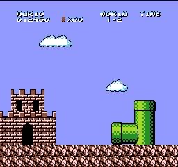
Now I'm working with the sprites, but I don't know if made them with an outline or not... 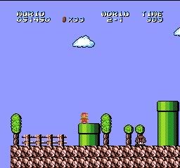 With outline With outline
 Without outline Without outline
Please tell me which one looks better ok? And by the way... Is there some way I can give diferent sprites to Fire Mario? thanks ^^ Pd: Sorry for the double post |
| Pages: 1 2 | Add to favorites | Next newer thread | Next older thread |
| Acmlm's Board - I3 Archive - ROM Hacking - A Super Mario Bros hack... |
| |
