 |
| Register | Login | |||||
|
Main
| Memberlist
| Active users
| Calendar
| Chat
| Online users Ranks | FAQ | ACS | Stats | Color Chart | Search | Photo album |
|
| | |||
|
| Register | Login | |||||
|
Main
| Memberlist
| Active users
| Calendar
| Chat
| Online users Ranks | FAQ | ACS | Stats | Color Chart | Search | Photo album |
|
| | |||
| 0 users currently in Modern Art. |
| User | Post |
| Kyoufu Kawa Posts: 861/1353 |
Ah hell, I'll take both XD |
| Kattwah Posts: 2189/3349 |
Ill take the second one...
It just needs to be more white and less gray (Because I have people complaining I use nothing but dark schemes) 
 |
| Darkdata Posts: 225/983 |
^Agrees with above.
If I had a acmlms forum I would use the first one. |
| Kyoufu Kawa Posts: 854/1353 |
First one's nice. I'll take it. |
| Danielle Posts: 4534/6737 |
First one is pretty cool looking, the second is dreadful. Just my opinion.
I'd use the first one if it had more twinkle star.  |
| Cirvania Posts: 450/1181 |
The first one was done using an awesome Phong tutorial on how to make cool dotted backgrounds using a few alpha's, patterns, and a bit of Gaussian blur.
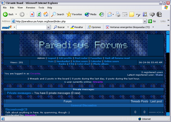
Here's another completely custom one I whipped up, called Classified. I wanted to go for a sort of grayish, no-frills look. 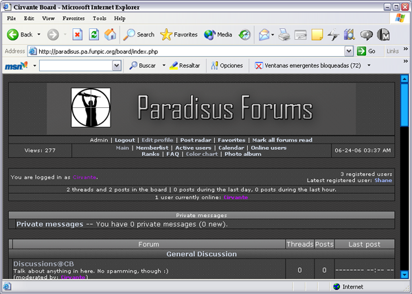
Yes, I still use IE. So sue me 
Feedback will be much appreciated.  |
