 |
| Register | Login | |||||
|
Main
| Memberlist
| Active users
| Calendar
| Chat
| Online users Ranks | FAQ | ACS | Stats | Color Chart | Search | Photo album |
|
| | |||
|
| Register | Login | |||||
|
Main
| Memberlist
| Active users
| Calendar
| Chat
| Online users Ranks | FAQ | ACS | Stats | Color Chart | Search | Photo album |
|
| | |||
| 0 users currently in Modern Art. |
| User | Post |
| Deleted User Posts: 1288/-7750 |
It adds to the feel of it. The Comic Sans does. |
| Kyoufu Kawa Posts: 806/1353 |
I'm with Glyph on the punchline and text bubbles, and add a complaint about Comic Sans. |
| Glyphodon Posts: 242/536 |
I actually liked the punchline. For the first 13 panels, however, the comic doesn't seem bad for the sake of parody or satire, it just sucks. This fails, but not quite as much as nearly everything else you've done.
And would text bubbles have killed you? If not, use them next time. If so, use them next time. |
| Riku Posts: 1047/1823 |
...The panels don't really show that much. It just sucks.
4 Ķŷŀĕ -Ŋ- Łāůŗēń says: idk.....mine is now the third worst...c ·$4 Ķŷŀĕ -Ŋ- Łāůŗēń says: compared to this OOOH BURN SHYGUY  |
| KTurbo Posts: 76/164 |
Originally posted by Apophis Oh yeah, too much non-sense for me. I'd like it if it was shorter.  Good one though. Good one though. |
| Lord SkyLart Posts: 245/307 |
Pretty good I guess, but next time why don't you try giving it a background and some text boxes. :p |
| Apophis Posts: 531/734 |
Its not supposed to make sense. That's what Luigi is pointing out at the end. I like it. |
| KTurbo Posts: 75/164 |
OMGWTFBBQ... I don't get it...?! |
| Skreename Posts: 732/1427 |
I don't think anything can be said besides "You have serious issues".
Also, you misspelled "mausoleum". |
| Deleted User Posts: 1271/-7750 |
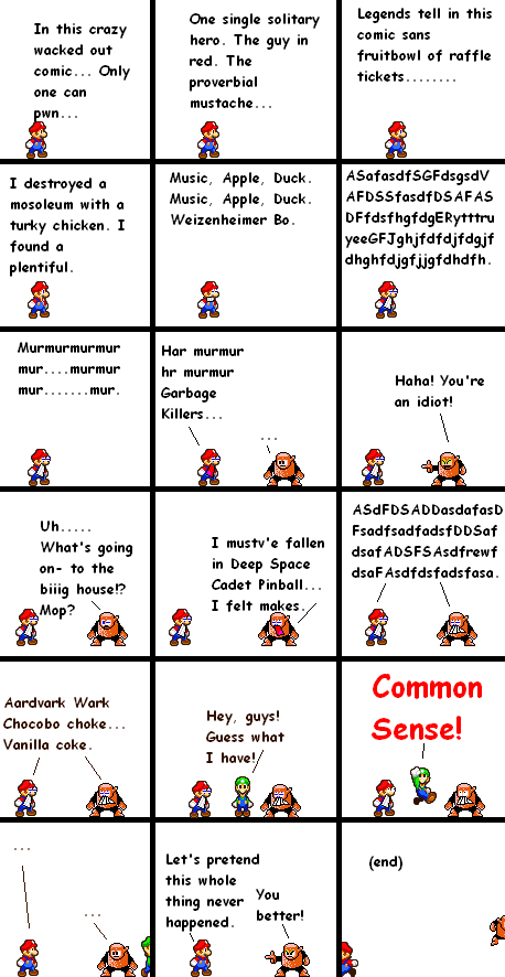
C+C plz I think it pwns. |
