 |
| Register | Login | |||||
|
Main
| Memberlist
| Active users
| Calendar
| Chat
| Online users Ranks | FAQ | ACS | Stats | Color Chart | Search | Photo album |
|
| | |||
|
| Register | Login | |||||
|
Main
| Memberlist
| Active users
| Calendar
| Chat
| Online users Ranks | FAQ | ACS | Stats | Color Chart | Search | Photo album |
|
| | |||
| 0 users currently in SMW Hacking. |
| User | Post |
| cory21391 Posts: 67/208 |
That was pretty funny, but seriously, I'll probably add trees on the hill to make it fuller/more 3-D (try to anyways) and maybe smooth it out and do an animation (which is something I've wanted to do, but dreaded the amount of time and effort I'd have to put in it; I suck at animations and hate it a little more everytime I make a new one) 
Anyways, I'll see what I can do, any suggestions for Land (Or foreground, to be vague)? |
| Tanooki Hero Posts: 11/21 |
The water fall reminds me of one of those cut away anatomy drawings from bio class...
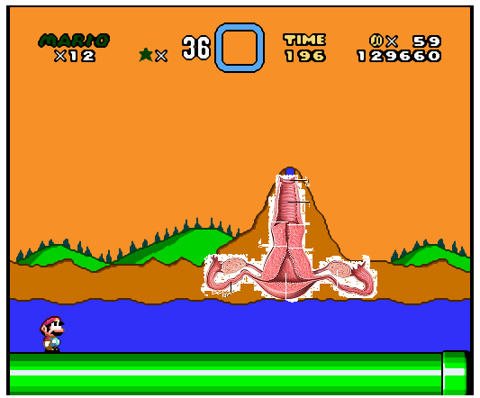
If you really want to be original thats how I would change it. But I don't think the adventures of mario on uterus mountain sounds like the next big hack. On a more constructive note. I like the green one better, the mountain looks too much like sky in the other one. Maybe if you added trees to the side of the mountains instead of just the crest it would look less flat. To make it stop looking like a uterus you could add a few things to the water fall, make it lighter then the other water and animate it like Xeruss suggested. Also, some mist or clouds at the bottom of the water fall would also make it look less flat. |
| cory21391 Posts: 66/208 |
Do you think anything should be added or smoothed out/fixed/edited....? |
| S.N.N. Posts: 755/2028 |
Personally, I like your first one, but I really hate the second one. The green ground in the front of the BG clashes too much with the darker green ground in the back of the BG.
However, as I said, the first one looks fine to me  |
| cory21391 Posts: 64/208 |
sorry, I meant the rocky land that is brown in the first pic and light green in the second. I coulud leave it brown and rocky, or make it green and grassy and smooth it out.
I was gonna make the waterfall animated, but I'm too lazy
I might after I finish this background and make new land for it. |
| Xeruss Posts: 240/309 |
My first suggestion is that you add a bit more texture... Granted this is a prototype, but... Yeah, anyway you should try and animate the waterfall, and for the record, blue/lightblue waterfalls generally look the best. |
| cory21391 Posts: 63/208 |
Well, I've worked on this and another of my level's foreground almost all day yesterday. I was wondering what you guys think. Should I add anything or take the trees out or anything that could be made better..? This IS a prototype and I'm not that great at backgrounds anyways. Which color should I use for the waterfall? Any other comments/suggestions.... |
