 |
| Register | Login | |||||
|
Main
| Memberlist
| Active users
| Calendar
| Chat
| Online users Ranks | FAQ | ACS | Stats | Color Chart | Search | Photo album |
|
| | |||
|
| Register | Login | |||||
|
Main
| Memberlist
| Active users
| Calendar
| Chat
| Online users Ranks | FAQ | ACS | Stats | Color Chart | Search | Photo album |
|
| | |||
| 0 users currently in Modern Art. |
| User | Post |
| netscape Posts: 16/90 |
that's the idea. |
| Alastor Posts: 1720/8204 |
emcee and netscape, can we not say ridiculous things that clearly extend beyond the boundaries of the sane?
And and by the way, thread creator, those comics stretch my tables  |
| netscape Posts: 15/90 |
How about a special characotr that when your computer loads it a robotic hand reaches out and smacks you in the back of the head to drive home that a statement is important?
The larger the type the harder it smacks. Course if you use the blink tag you could end up knocking someon esenseless, and it would only be half as annoying as celion dion tunes. |
| emcee Posts: 127/867 |
I suggest we all start using the declinterroclamination: █. It acts a question mark, exclamation point, closing double quote, and period ending a declarative sentence. Also the amount of exclamation is three times that of a standard exclamation point. Therefore, ugly sentences like this:
He said, "What is that!!!?". Become this: He said, "What is that█ |
| Tarale Posts: 289/2713 |
Originally posted by Zem I agree, I find it less expressive too. I understand why the guy created it; but I really don't find it as expressive. Besides, if you use it, aside from some fans of it; you're probably going to confuse other people... |
| Zem Posts: 305/1097 |
The interrobang is overrated by its fans. Sure, maybe it has its uses, but there's a reason it didn't catch on: it doesn't read very easily, it doesn't save much effort, and it's actually less expressive than either of ?! and !?.
On the other end of the spectrum, it's boring in unserious writing too: DUNGEONS ***AND*** DRAGONS?!?!??!?!?!?!?!??! vs. DUNGEONS ***AND*** DRAGONS‽‽‽‽‽‽‽‽‽‽‽‽‽‽‽‽ |
| spel werdz rite Posts: 517/1796 |

Okay, now I know! Anyways, Snow Tomato, are you going to make some more? I love these! |
| Tarale Posts: 287/2713 |
Originally posted by spel werdz riteOriginally posted by Alastor the StylishAll I see is a rectangle, but I think you meant to show "..." Nah, it's meant to be a ! and a ? together. Interrobang |
| Alastor Posts: 1715/8204 |
...
See, there's this thing called "context" that people use to find what other people mean when they're not sure what one part of what the person said meant. I used the word "interrobang," and if you don't know what that means you might want to go look it up. I think you will find that it fits there far better than an ellipsis does. |
| spel werdz rite Posts: 513/1796 |
Originally posted by Alastor the StylishAll I see is a rectangle, but I think you meant to show "..." |
| Alastor Posts: 1712/8204 |
This comic amuses me, which is better than I can say for most any other comic out there. Zem's right, though.
This comic would also have quite a bit of use for a periodic interrobang. ?!!! is just not something anyone likes looking at when ‽ does just as well. |
| spel werdz rite Posts: 500/1796 |
Originally posted by LuigiSorry, it only goes to 7-4 
Oh and btw, love the comics! Probably because I love anything Mario! |
| Joakim von Anka Posts: 33/45 |
Try to make the text equidistant from the sides of the boxes. And make sure there is space between the text and the boxes, too.
I'd suggest making the text green and red, not black. Also, try rounded text boxes. Finally, don't overuse punctuation. "!" gets the message across. "!!!" is ok, but "!!!!!!!!!!!!!" is just too much. Same with "....................." and "????????". |
| Tatrion Posts: 290/2467 |
You should remove the status bar at the top. It doesn't really add anything, since you didn't add points when Mario squished that goomba. |
| Zem Posts: 298/1097 |
The writing's good and the jokes range from lame to decent, so it's a step ahead of most sprite comics right there. (I'm not a fan of punchlines, but that's just me.)
The little "screen" for each panel is kinda cute, but not interesting enough to justify having every single panel that size. No errors in the visual presentation, but with a little more effort you could make it look a lot better. Overall, it's hovering around mediocre, tipping slightly towards good. In other words, it kicks ass compared to most other sprite comic startups. I encourage you to continue. |
| Snow Tomato Posts: 28/798 |
Behold the combination of boredom and copying images from the original super mario emulator..
I've been home all day doing nothing, because I'm sick.. so I guess I'll continue with these if people like them enough. Uh, if you have a high screen resolution... these are much easier to veiw. Comic #1 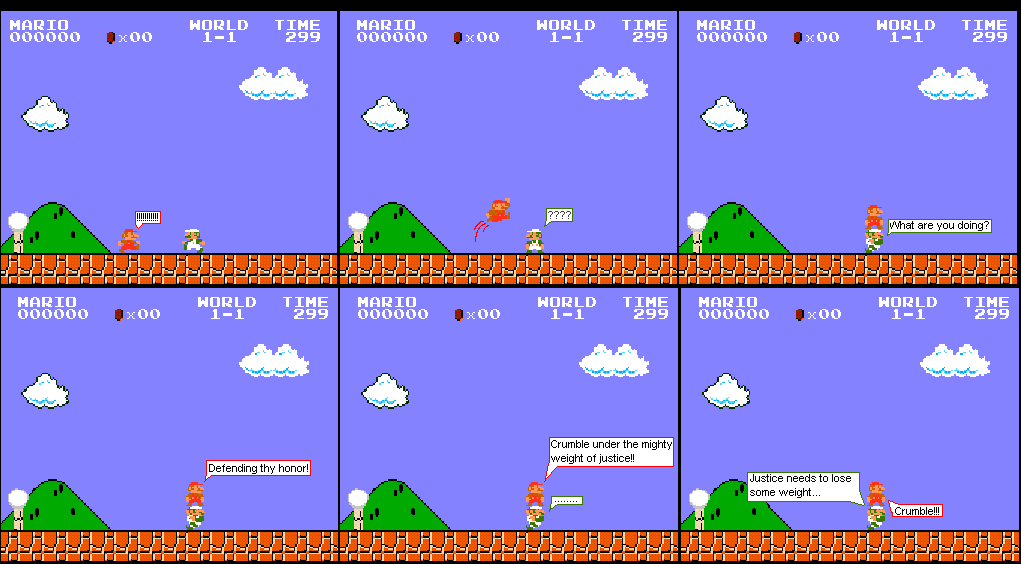
Comic #2 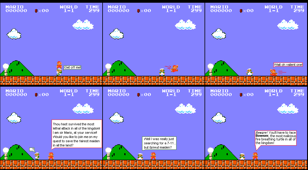
Comic#3 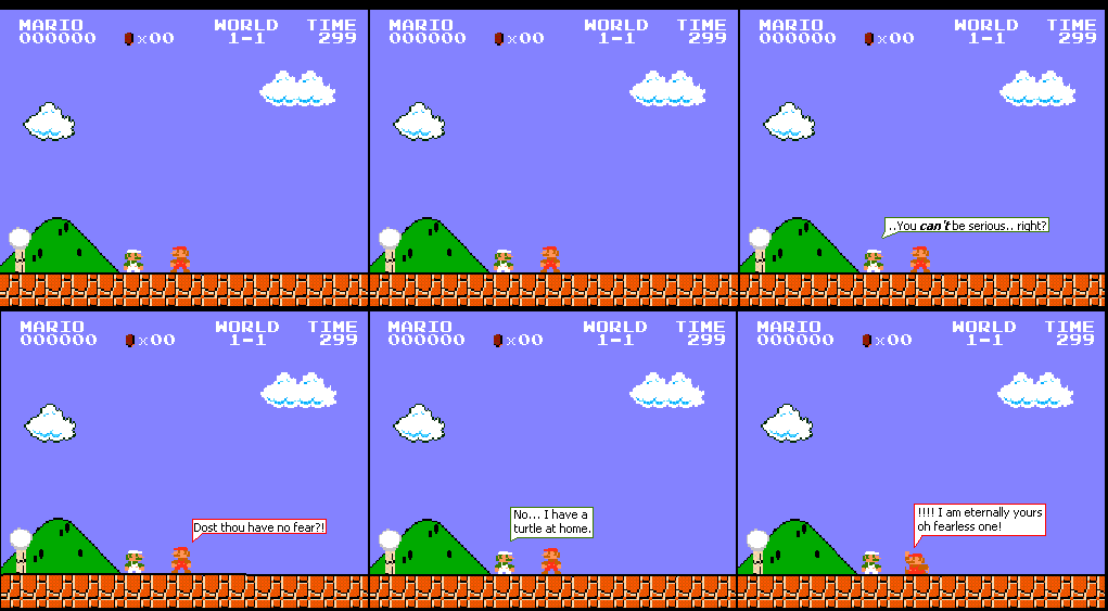
Comic#4 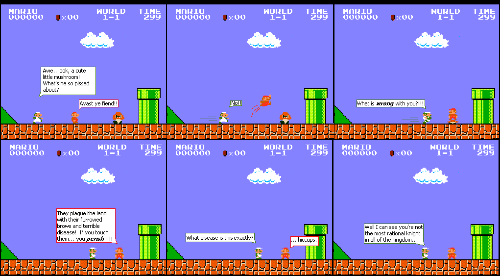
So.. uh.. questions? comments? intelligent life? |
