 |
| Register | Login | |||||
|
Main
| Memberlist
| Active users
| ACS
| Commons
| Calendar
| Online users Ranks | FAQ | Color Chart | Photo album | IRC Chat |
|
| | |||
|
| Register | Login | |||||
|
Main
| Memberlist
| Active users
| ACS
| Commons
| Calendar
| Online users Ranks | FAQ | Color Chart | Photo album | IRC Chat |
|
| | |||
| 0 user currently in Modern Art. | 1 guest |
| Acmlm's Board - I2 Archive - Modern Art - Logo for a hack of SMW- looking for comments |
 | |  | |  |
| Pages: 1 2 | Add to favorites | "RSS" Feed | Next newer thread | Next older thread |
| User | Post | ||
|
Sukasa Boomboom Error 349857348734534: The system experienced an error. Level: 57 Posts: 1470/1981 EXP: 1446921 For next: 39007 Since: 02-06-05 From: *Shrug* Since last post: 6 days Last activity: 1 day |
| ||
Yeah, I made a logo for my hack that my family thoughht was neat, and I would like to know what I could do to improve it before finalizing it, and figured this was the best place in the internet for that purpose. It might take a while to load, I used freewebs instead of the usual photobucket to get past the 250 kb size limit on pictures. (470 kb png). (link to imageshack) |
|||
|
Yoshi Dude XKEEPER STOLE MY CAR KEYS Level: 79  Posts: 2579/3271 EXP: 4572680 For next: 6787 Since: 03-15-04 From: give me a number folks. Since last post: 3 hours Last activity: 2 hours |
| ||
Ecch.  This does not look good at all. This does not look good at all.The blue text is very hard to read. You didn't notice this? You put some sort of background behind it, to make it stand out, why did you chose a color that clashes with it? The reason I'm pointing out the text is because you think it's neat. Forget everything else about this logo, I am just baffled by why people think unreadable text is okay. But I'm not suggesting that you just change the font color. You should just scrap that completely, and start over. It's just bad. The text, t hat book in the corner, the obvious photoshop abuse. Oh man.. the abuse. You don't need to go nuts with photoshop features to make a nice logo, really. You ought to google photoshop tutorials if you really want a few nice effects. |
|||
|
Keikonium Banned Level: NAN Posts: 2076/-2459 EXP: NAN For next: 0 Since: 04-02-04 Since last post: 63 days Last activity: 9 hours |
| ||
I'm going to have to agree with YD here. This just looks bad. I recommend you use drop shadow and a 1px stroke for the text. It always makes it looks so great imo. Also, the BG looks bad too. The cobblestone has some weird visual style. It looks like it's above the book, but under the brown stuff that the text is ontop of. However the brown stuff is under the book . Start over and maby use some images from your hack in it? Fix that text (meaning no blue, and readable) . Start over and maby use some images from your hack in it? Fix that text (meaning no blue, and readable) |
|||
|
Sukasa Boomboom Error 349857348734534: The system experienced an error. Level: 57 Posts: 1472/1981 EXP: 1446921 For next: 39007 Since: 02-06-05 From: *Shrug* Since last post: 6 days Last activity: 1 day |
| ||
| I think I will start over then. Well, thanks for the comments, but you have one thing wrong- I didn't use photoshop, I used fireworks MX 2005. EDIT: I redid the logo, again with Fireworks MX 2005. Lucky me I actually had another day left in the trial period... 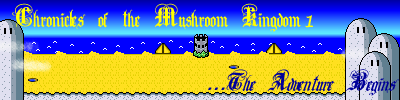 Yea, I kept the text, but only because it was the only "Old English" style text I had, so I didn't really have too much of a choice. If it still doesn't look too good, I wouldn't be surprised, since I'm a crappy artist anyways... (edited by Sukasa on 07-29-05 03:14 PM) |
|||
Prier Archangel Administrative Priestess. NUCLEAR SUB WEEEOOOO Level: 119  Posts: 6899/8392 EXP: 18790939 For next: 138352 Since: 03-15-04 From: Nerima Dist. - Tokyo, Japan Since last post: 1 day Last activity: 1 day |
| ||
| I'm not liking the font in the new one. For some reason, it just doesn't really portray a Mario-ish feel. I'd do something a little more basic that the stylish calligraphy font you have there. (edited by Priere on 07-29-05 03:28 PM) |
|||
|
Sukasa Boomboom Error 349857348734534: The system experienced an error. Level: 57 Posts: 1477/1981 EXP: 1446921 For next: 39007 Since: 02-06-05 From: *Shrug* Since last post: 6 days Last activity: 1 day |
| ||
| All right. I actually re-used the same text in both, but in the second I tried to make it more readable. How is the rest of the logo? | |||
|
Keikonium Banned Level: NAN Posts: 2083/-2459 EXP: NAN For next: 0 Since: 04-02-04 Since last post: 63 days Last activity: 9 hours |
| ||
| It's very contrasting and bright. Go for something really simple, and I'm telling you that shots from your hack will work. Also, what are the yellow triangles on the beach? I like the text but it's still kinda hard to read. I would love to make a logo for you in PS (I re-downloaded it and it works now) if you want. Just tell me what you want in it. Here is my button for my hack when ever it may get released:  You need less contrasting, and more clear images for it to look good  . . |
|||
|
Sukasa Boomboom Error 349857348734534: The system experienced an error. Level: 57 Posts: 1483/1981 EXP: 1446921 For next: 39007 Since: 02-06-05 From: *Shrug* Since last post: 6 days Last activity: 1 day |
| ||
Well then, how's this? I changed the text, and used screens from in-game instead of LM like you'd suggested. |
|||
|
Keikonium Banned Level: NAN Posts: 2092/-2459 EXP: NAN For next: 0 Since: 04-02-04 Since last post: 63 days Last activity: 9 hours |
| ||
Perhaps I wored myself wrong . Yes you have in-game images, yes they are clear (except the big invisible Mario . Yes you have in-game images, yes they are clear (except the big invisible Mario ), and yes nothing severly contrasts, but this is not looking great. It's cluttered, it's messy, it just looks like a quick paint cut and paste job with an invisible mario overtop of it. ), and yes nothing severly contrasts, but this is not looking great. It's cluttered, it's messy, it just looks like a quick paint cut and paste job with an invisible mario overtop of it.Look here, I made you a quick banner:  This took me about 10 minutes to make. Use it if you would like to . No credit required (I just want to try out your hack when it gets released!) |
|||
|
KATW King Yoshi "If you stare at something long enough, it can be funny." Level: 86  Posts: 3306/3959 EXP: 6087979 For next: 54128 Since: 03-15-04 Since last post: 7 hours Last activity: 5 hours |
| ||
Youre going for something way too fancy Sukasa. Simple, and easy to read is what everyone likes.  Go with something like Kei here. No fancy fonts, no weird graphic changes, something eye catchy and pretty, while still being readable. It can easily be made in paint to be good. Honestly, the first two, I thought that was your signature |
|||
|
Snika Boo Level: 44  Posts: 313/916 EXP: 600678 For next: 10607 Since: 07-21-04 From: Freezing Cold Alaska! Since last post: 2 days Last activity: 2 days |
| ||
| Sukasa, I think your going for the wrong effect. You shouldn't make logos too busy with too many images. Keikonium pointed you in the right direction with using one screenshot and readable text. I think you could get it Sukasa if you tried again. The last one was an improvement. =P Snika |
|||
Danielle Local Moderator  Level: 76  Posts: 1223/3359 EXP: 3958078 For next: 47982 Since: 09-15-04 From: RATE Since last post: 3 hours Last activity: 3 hours |
| ||
| In all of them, they're difficult to read. Choose a simple font, a good color that will show up against the image, and keep it simple. Yours all seem so busy.. the text is the worst part though. If you look at Keikonium's, his text is legible, which is nice. The black on black is a stretch for readability though, I think. You could definitely make a good one, just try keping it simpler than what you're doing now. And most importantly, make it readable and clean. |
|||
|
Sukasa Boomboom Error 349857348734534: The system experienced an error. Level: 57 Posts: 1492/1981 EXP: 1446921 For next: 39007 Since: 02-06-05 From: *Shrug* Since last post: 6 days Last activity: 1 day |
| ||
| All right, I'll try again. Kei, yours looks great except for one thing- you used a screen from COTMK 2, not COTMK 1. EDIT: If this one isn't good, I'm going to ask kei to make me one because Fireworks just ended it's trial period. 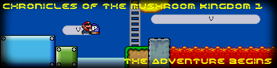 (edited by Sukasa on 07-29-05 10:09 PM) |
|||
|
Keikonium Banned Level: NAN Posts: 2094/-2459 EXP: NAN For next: 0 Since: 04-02-04 Since last post: 63 days Last activity: 9 hours |
| ||
| We have a winner!! That one looks good, the text is readable, and its from COTMK1. Great job, you have it now  ! !~EDIT~ If you want, I still have the .psd for the one I made. I can make it say 2 instead of 1, or whatever else for your second hack . If you want it, just let me know.(edited by Keikonium on 07-29-05 10:26 PM) |
|||
|
Sukasa Boomboom Error 349857348734534: The system experienced an error. Level: 57 Posts: 1497/1981 EXP: 1446921 For next: 39007 Since: 02-06-05 From: *Shrug* Since last post: 6 days Last activity: 1 day |
| ||
...Finally. Kei, I'm going to take you up on your offer (but for COTMK 2 ), but you have to credit yourself with it for it to be used, K? ), but you have to credit yourself with it for it to be used, K? |
|||
|
Keikonium Banned Level: NAN Posts: 2097/-2459 EXP: NAN For next: 0 Since: 04-02-04 Since last post: 63 days Last activity: 9 hours |
| ||
Here is the one with my name:  And here is the one that doesn't have my name:  Your choice . |
|||
|
Sukasa Boomboom Error 349857348734534: The system experienced an error. Level: 57 Posts: 1500/1981 EXP: 1446921 For next: 39007 Since: 02-06-05 From: *Shrug* Since last post: 6 days Last activity: 1 day |
| ||
 Nice, but it would be a good idea to keep the (psd?) file file around a bit, I might have something else in store for where "the adventure continues" is. Nice, but it would be a good idea to keep the (psd?) file file around a bit, I might have something else in store for where "the adventure continues" is. |
|||
|
stag019 Snifit Level: 23 Posts: 201/299 EXP: 62259 For next: 5464 Since: 06-10-05 From: C:\Documents and Settings\stag019\Desktop Since last post: 9 days Last activity: 7 hours |
| ||
| I like the one without your name. I think those are better than the knew ones. |
|||
|
Violent J Melon Bug Level: 41 Posts: 498/749 EXP: 479154 For next: 991 Since: 05-05-04 From: Since last post: 8 hours Last activity: 8 hours |
| ||
Something simple an nice is what really makes something stand out. Sorta like  ) )  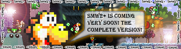 If you want Sukasa, I can make you a banner. I have been making banners like monthely now for hacks and site, so you might want to catch me while im still in the mood! (edited by Sonicandtails on 07-30-05 12:03 AM) |
|||
|
Sukasa Boomboom Error 349857348734534: The system experienced an error. Level: 57 Posts: 1505/1981 EXP: 1446921 For next: 39007 Since: 02-06-05 From: *Shrug* Since last post: 6 days Last activity: 1 day |
| ||
| Thanks, but Keikonium has already signed up for that one... Maybe I'll see if you can do COTMK 3? (like that's ever gonna come out this decade) |
| Pages: 1 2 | Add to favorites | "RSS" Feed | Next newer thread | Next older thread |
| Acmlm's Board - I2 Archive - Modern Art - Logo for a hack of SMW- looking for comments |
| | |

